EL SERENO, CA
Williams Place
WHOLE HOUSE RENOVATION
About
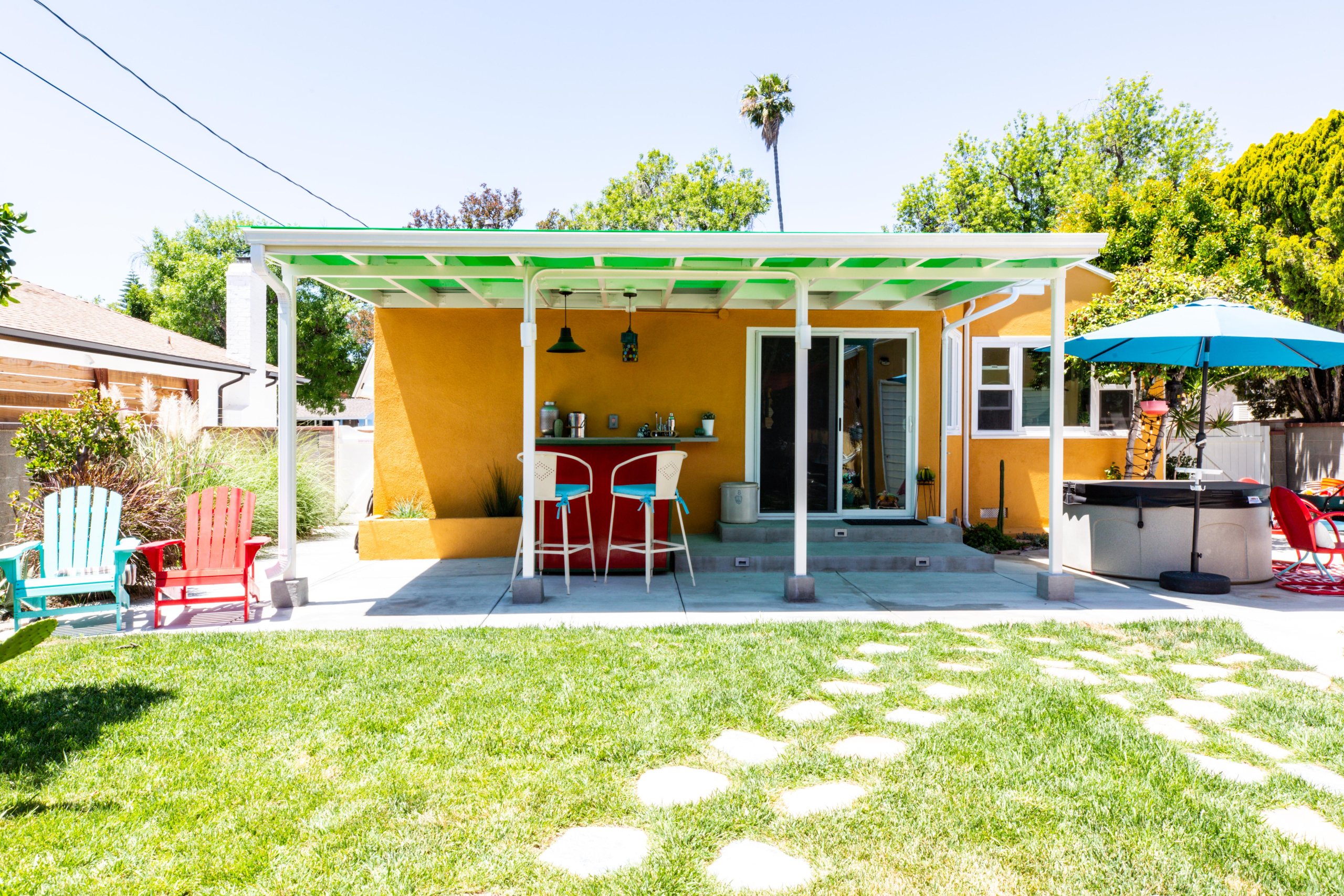
What this teeny home lacks in square footage, it makes up for in splashy delicious color, pattern, and whimsy.
We were contacted by our client while she was on a break from her television writing career, to help her revamp her forever home from the studs outward. She had a passion for color and pattern. We kept a very light hand and encouraged her to think boldly and lean into her happy place. The result is a barely constrained explosion of joy and color that fully reflects the effervescent personality of our delightful client.
“…everywhere you look, some bright and whimsical detail bedecks the home.”
LOCATION
Los Angeles, CA
SIZE
672 ft² / 62.4 m²
CATEGORY
Residential
CLIENT
El Sereno
FOCUS
Whole Home Renovation

What Was Once Half is Now Whole
Brass Monkey, that Funky Monkey
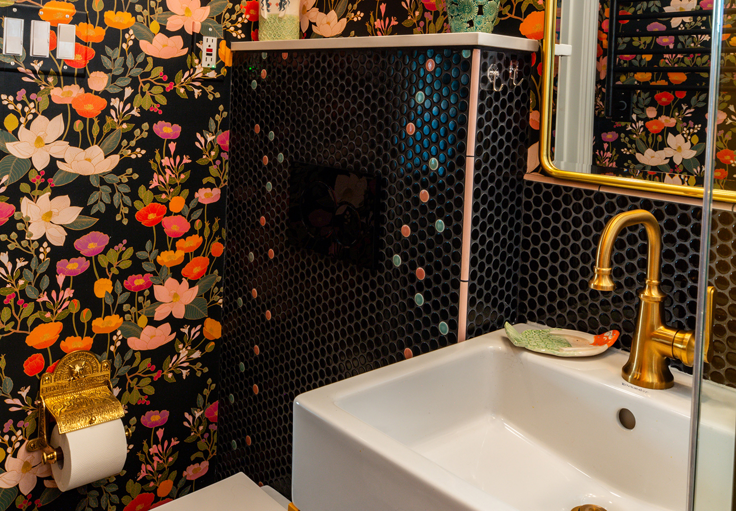
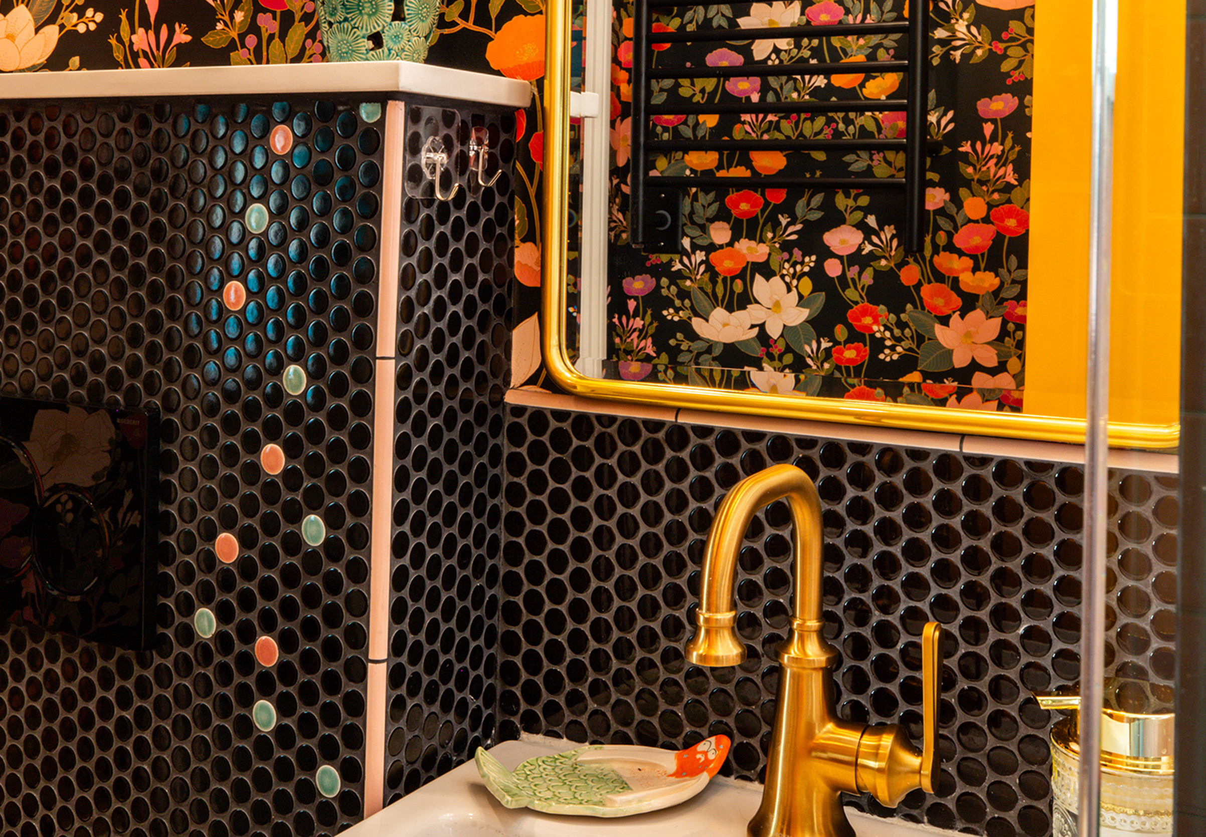
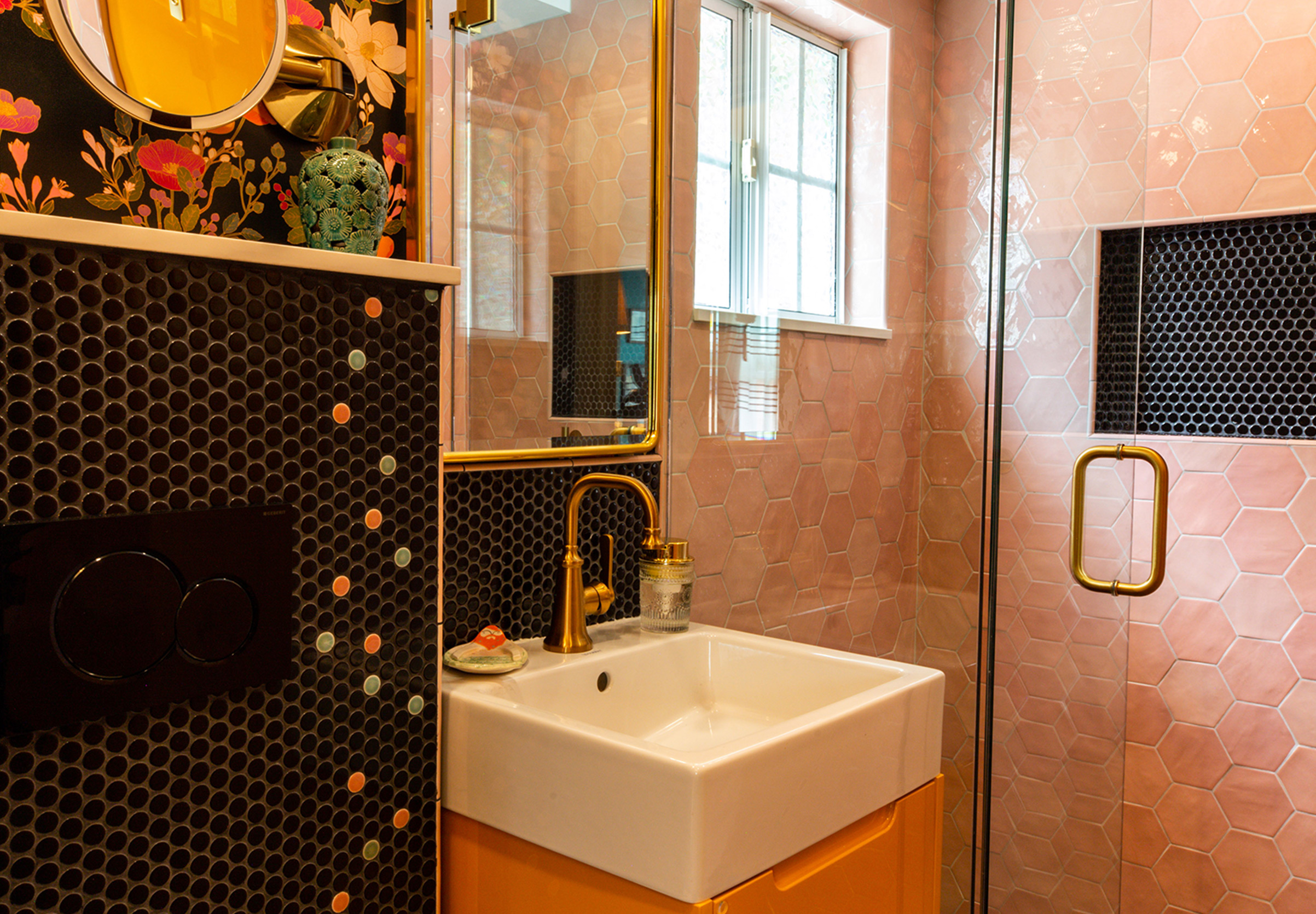
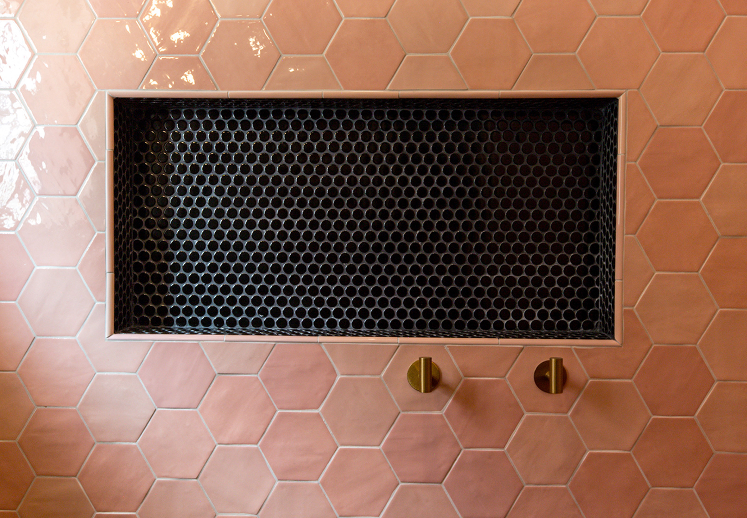
After relocating the laundry machines from an adjacent kitchen alcove to another part of the house, we captured just enough space to add a walk-in shower to this existing primary bedroom half-bath. Closing one of the two side-by-side windows made space for an oval in-wall medicine cabinet. The wall mounted toilet became a feature with penny rounds hand picked out of the mesh to create the bubbling effect in soft rose and cheeky aqua. The floor tile’s geometrics set on a diagonal keep the eye moving to the very back of the shower. A bubblegum pink zellige tile in a hex shape was keyed to the blush pink of the flowers in the lush jungle washable wallpaper. Another bold choice: high-gloss marigold floating cabinets that tripled the storage space in this bathroom. Brass finishes keep the vibe warm and otherworldly.

5 IMAGES – CLICK IMAGES OR ARROWS TO SEE MORE.
Spotlight on Appliances
Function, Function, Function!
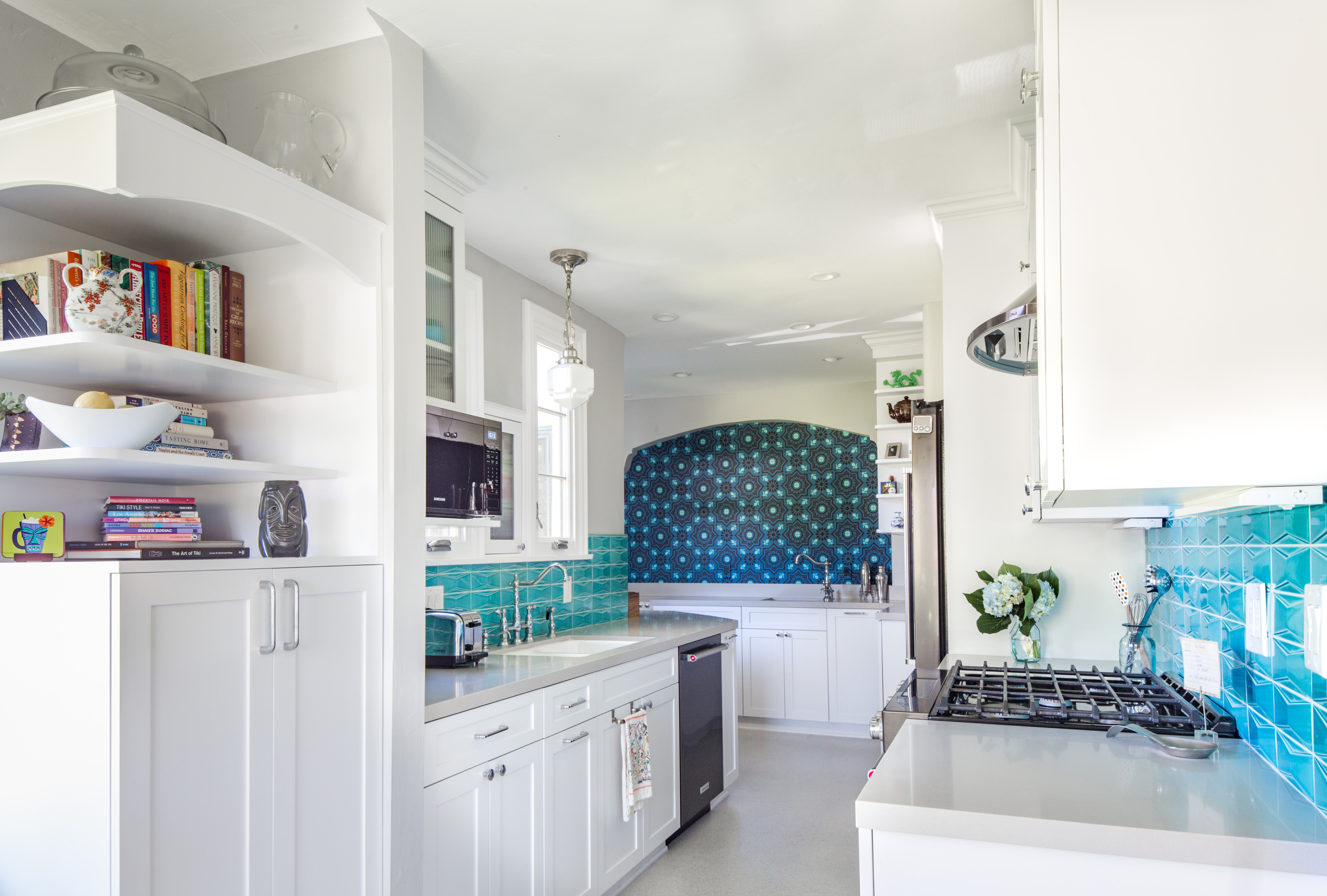
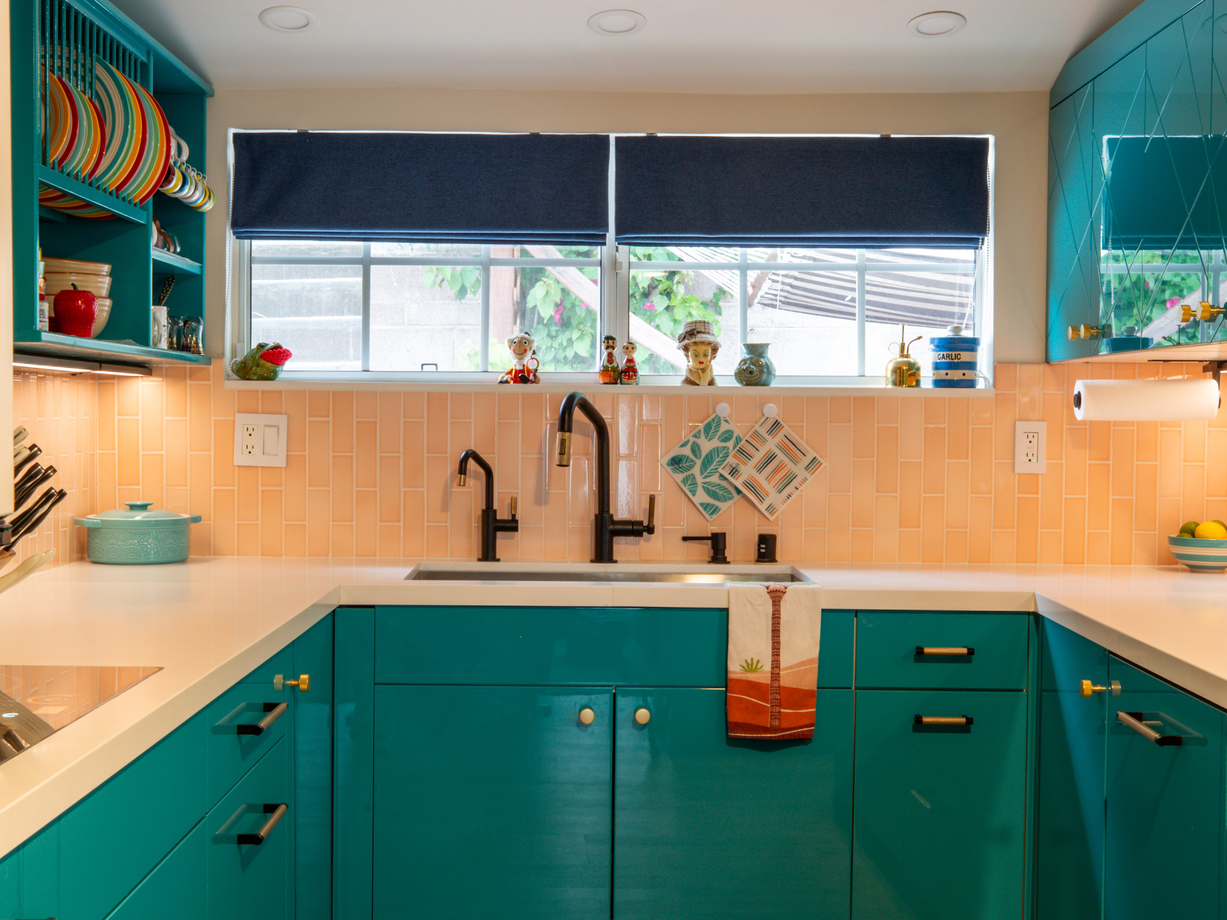
The most important priority on our client’s kitchen wish list was a full suite of GE Café appliances. She was especially keyed into the finish on the handles, which we went to great lengths to find in other hardware finishes for the cabinetry and faucets. With a lot of cabinetry required, we stretched a fairly streamlined budget using pre-fab cabinetry. Simple melamine boxes feature hi-gloss full overlay doors in a juicy teal. We intermixed laser cut patterned doors with plain cabinet fronts to provide a bespoke detail that gives extra life to an otherwise uniform appearance.


When we finally got down to brass tacks on the appliances we selected other brands for the workhorses of refrigeration and dishwashing—then hid those appliances behind cabinetry panels and used more GE Café handles to tie them in. A painted blue hood picks up the cobalt in the Mediterra tile behind the stove. A vertical field of glossy cameo pink Subway Ceramics tile gives the space warmth and is reflected in the iridescent pink lampshades of the pendants over the peninsula.

Using bright white quartz countertops and high gloss cabinetry to reflect light all around, kept the small space feeling delightfully airy, despite floor to ceiling cabinetry in multiple zones of the house.


Clean Up on Aisle Five

One of the quirks of this house, was that as some point the former owners had enclosed a back service porch, tying the roofline to a 7’ high concrete block retaining wall. This presented an opportunity to reclaim some much-needed space for side-by-side laundry machines that had been taking up an alcove on the far side of the kitchen. We added a full height broom closet for an entire bank of doors that conceal necessary machines. Our client added a hand-printed stencil to mimic the tile over the stove, and we scored an Ikea walnut island countertop to provide a budget-friendly deep folding surface.
Gentlemen, it Goes Here
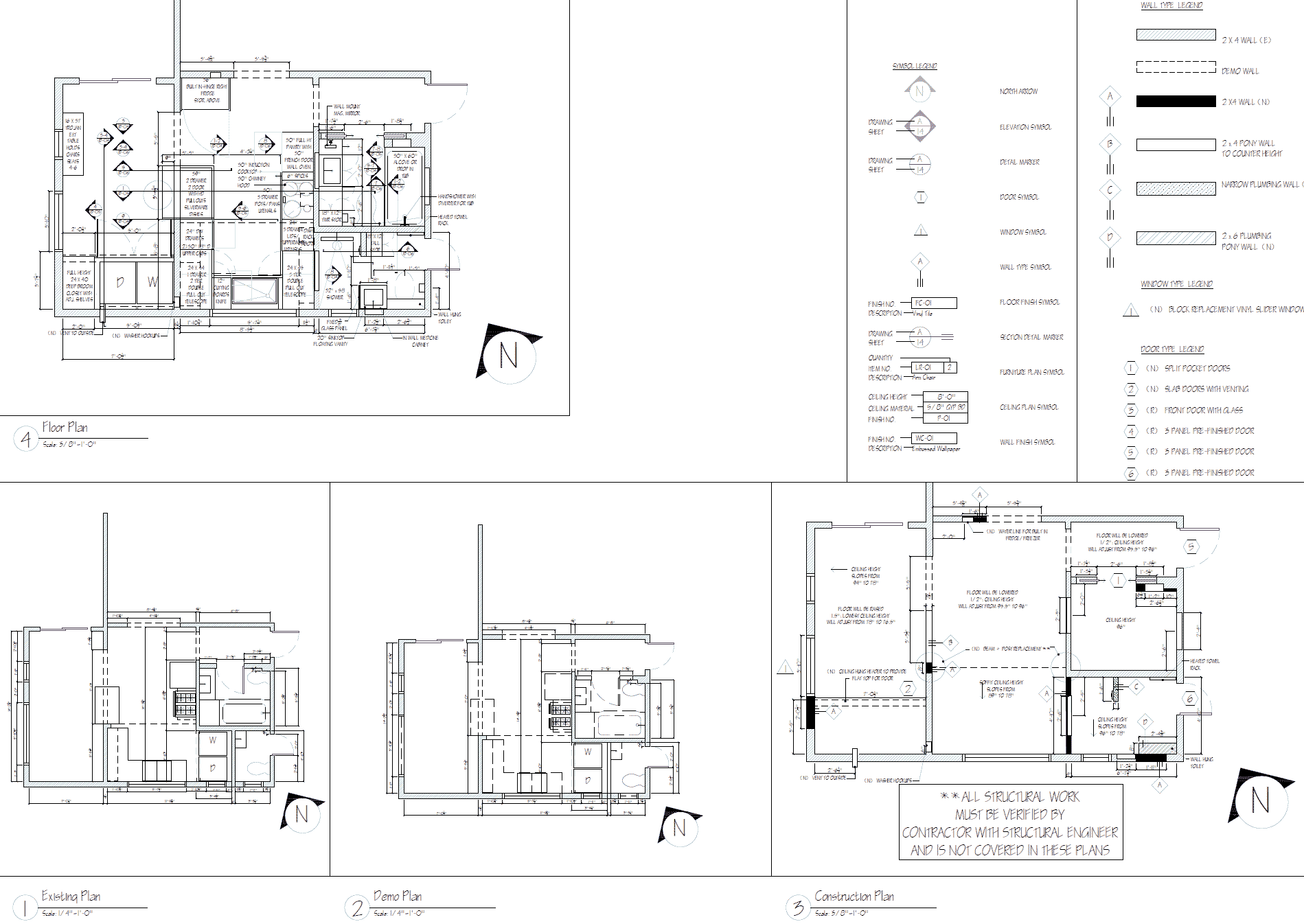
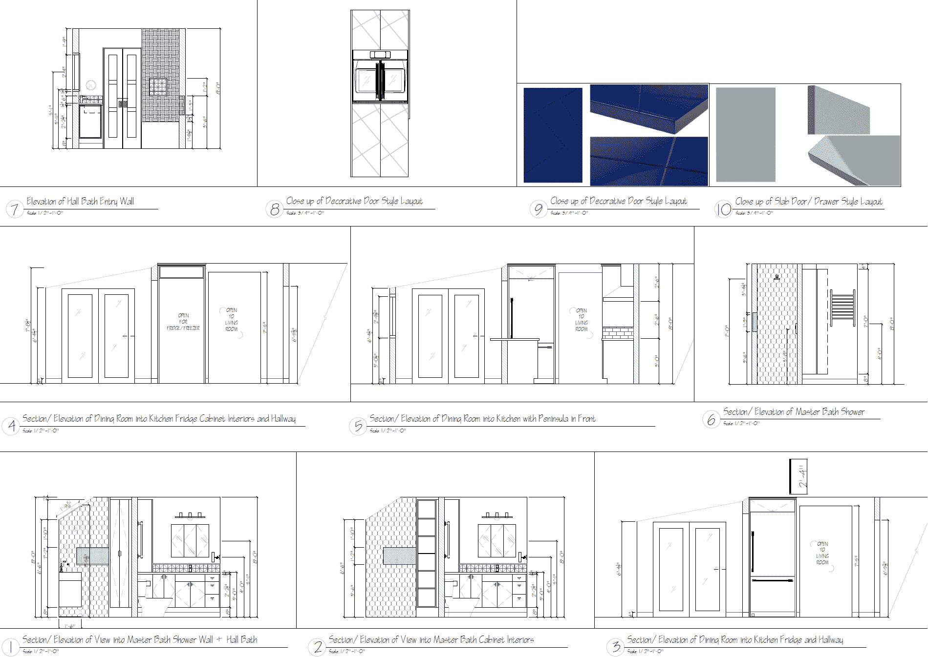
Nothing in a 1928 house is straight or plumb, and this house was no exception. By providing carefully detailed plans, our installers were armed with the best information as a starting point. As walls were opened and surprises uncovered, we were able to nimbly adjust to accommodate the needs of the house.


6 IMAGES – CLICK IMAGES OR ARROWS TO SEE MORE.
The Vertical Rise of the Angry Owl
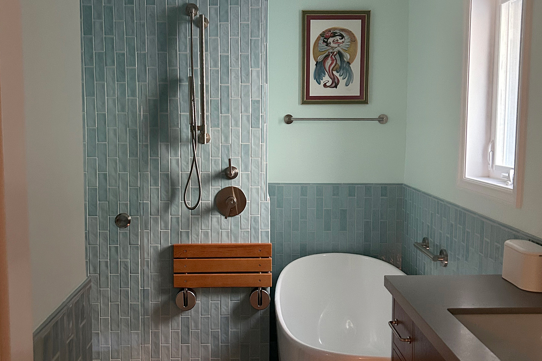
The vertical tile in the tub area of this bathroom was hand placed in full-scale mockups we laid out on the kitchen floor and provided to the tile installer on the fly. The cabinetry color’s leaf green was selected to balance the saturated reds, oranges and teals of the wall tile. We used a mix of Fireclay and Dal-tile to keep the budget in balance. The hilarious Spoonflower wallpaper, like almost every design choice, was selected because it made our client giggle.


That’s the Pitter-Pat of Patterns
We tested out several combinations of patterns both in tile and wallpaper, relying on the high gloss finish of the cabinetry to bounce colors around. Layering patterns united in color allows the eye to roam where it wants to, without being overwhelmed. There is an energy and vitality to these designs that uplifts the spirit. A true reflection of our client’s zest for life.


Project Details:
|
|
|
|
|---|