NORTH HOLLYWOOD, CA
The Juice Parlor
RESTAURANT/RETAIL
About
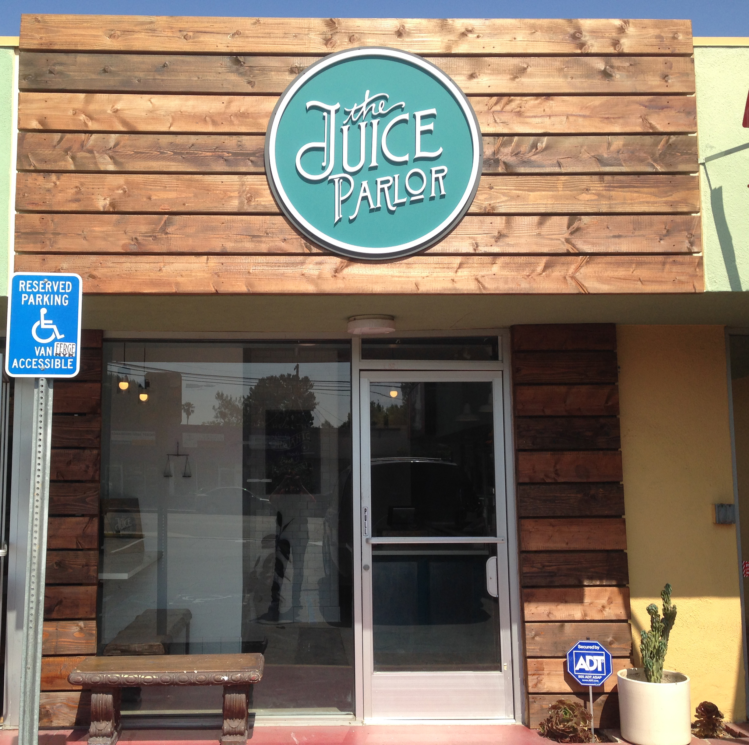
A teeny-tiny unit in a strip mall in North Hollywood that had been running as a weed growing location had been chosen by the owners to create a new kind of smoothie/juice concept where the branding would define everything from the name of the drinks to the ingredients therein. The space needed to be completed gutted, with every service added to it, including trenching to the street. The owners were a young couple with a few dollars and a dream to make it happen.
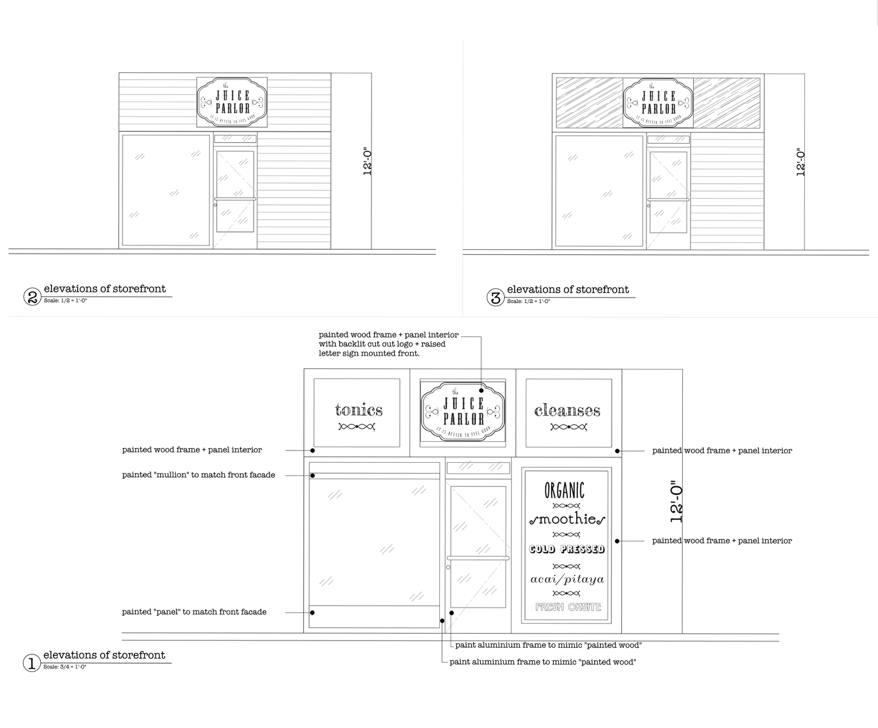
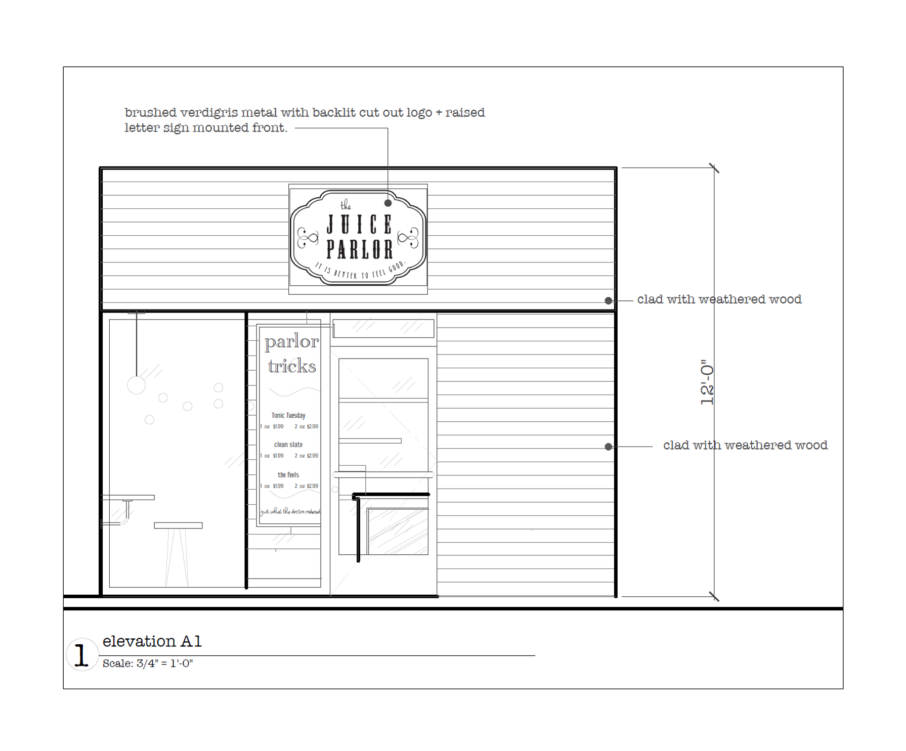
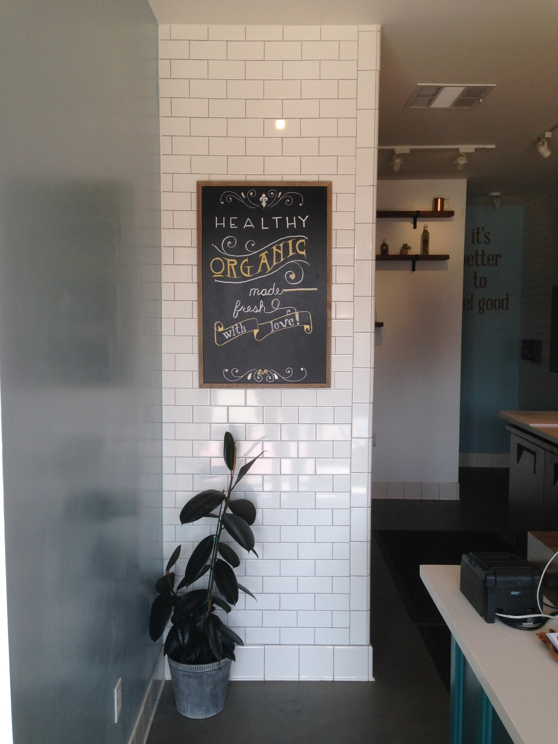
They wanted something that spoke to the medicinal nature of food and after searching the marketplace, we proposed an old-world apothecary approach. The tiny nature of the shop lent itself to the charming painted wainscotting wood and white tile interior that would make features of the fruit and allow fancy lettering and fonts carry the weight of the design.
“…the design is beautiful and uplifting. Loved the actual shop.”
LOCATION
North Hollywood, CA
SIZE
367² / 34m²
CATEGORY
Restaurant/Retail
CLIENT
Dimitri Ciolache and Sarina Helen
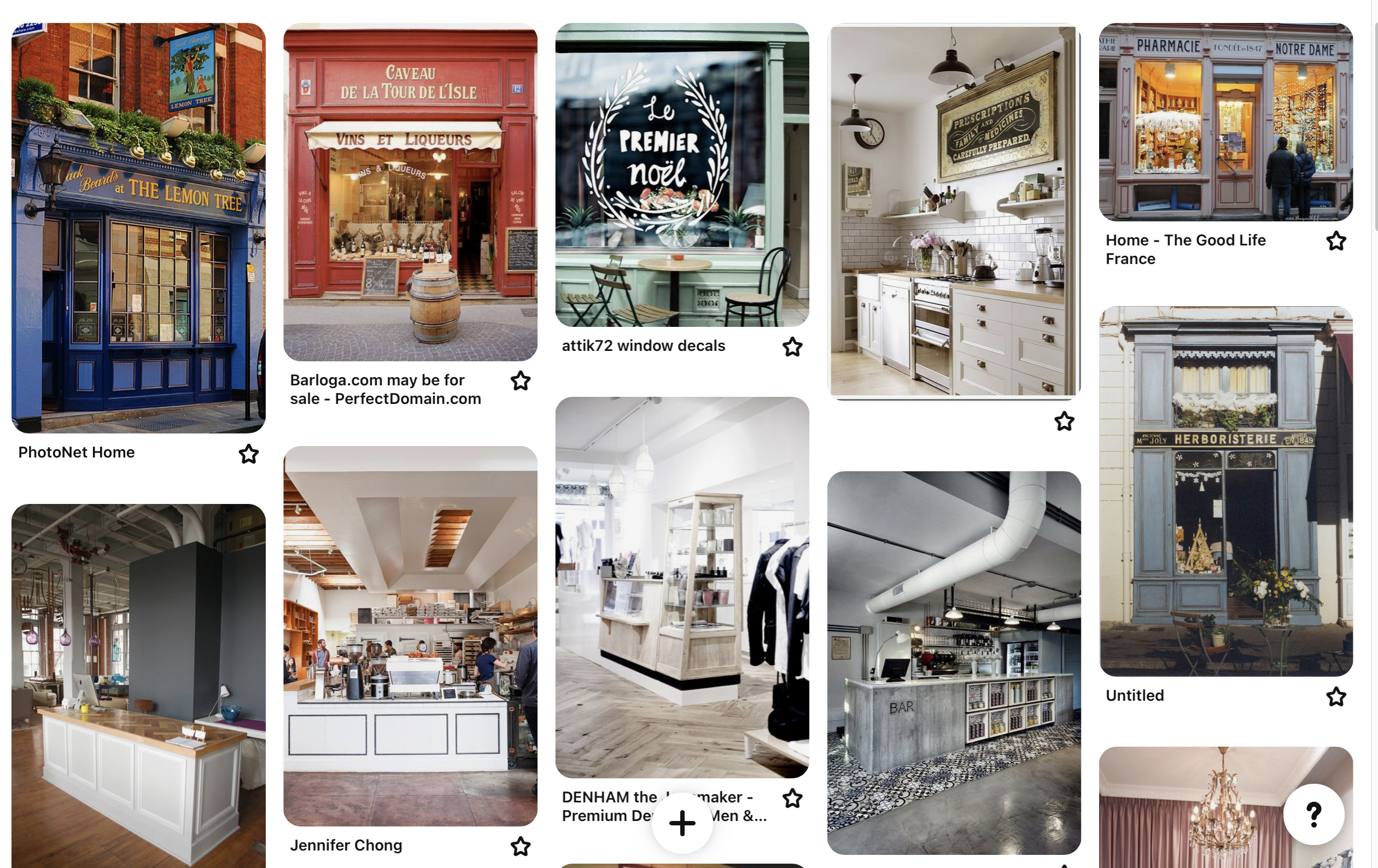
Inspiration
Old World Influences
Our approach to the design was to pull from vintage apothecaries of Europe and early 20th century Americana in the feel of the finishes and branding. to bring a deeper level of connection to food as a source of mental and physical satisfaction.
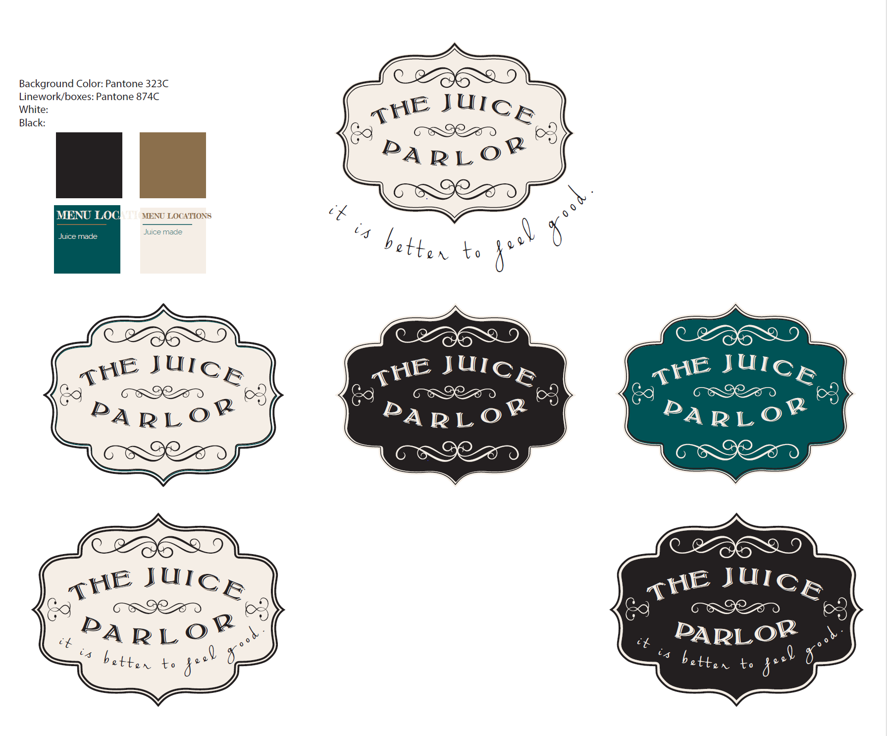
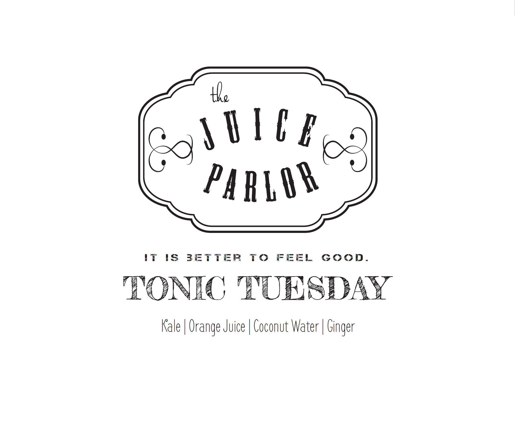
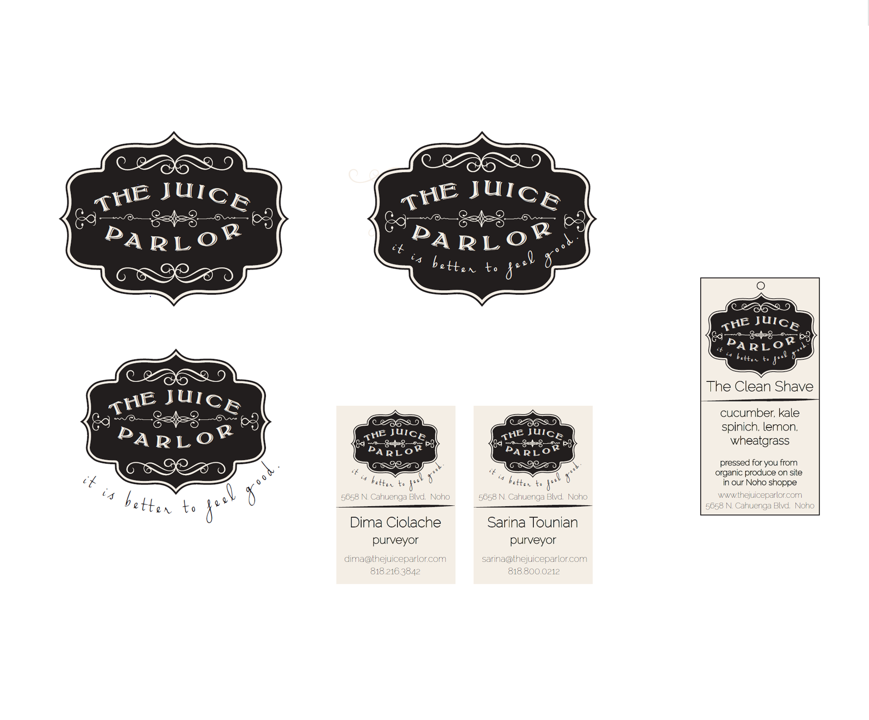
5 IMAGES – CLICK IMAGES OR ARROWS TO SEE MORE.
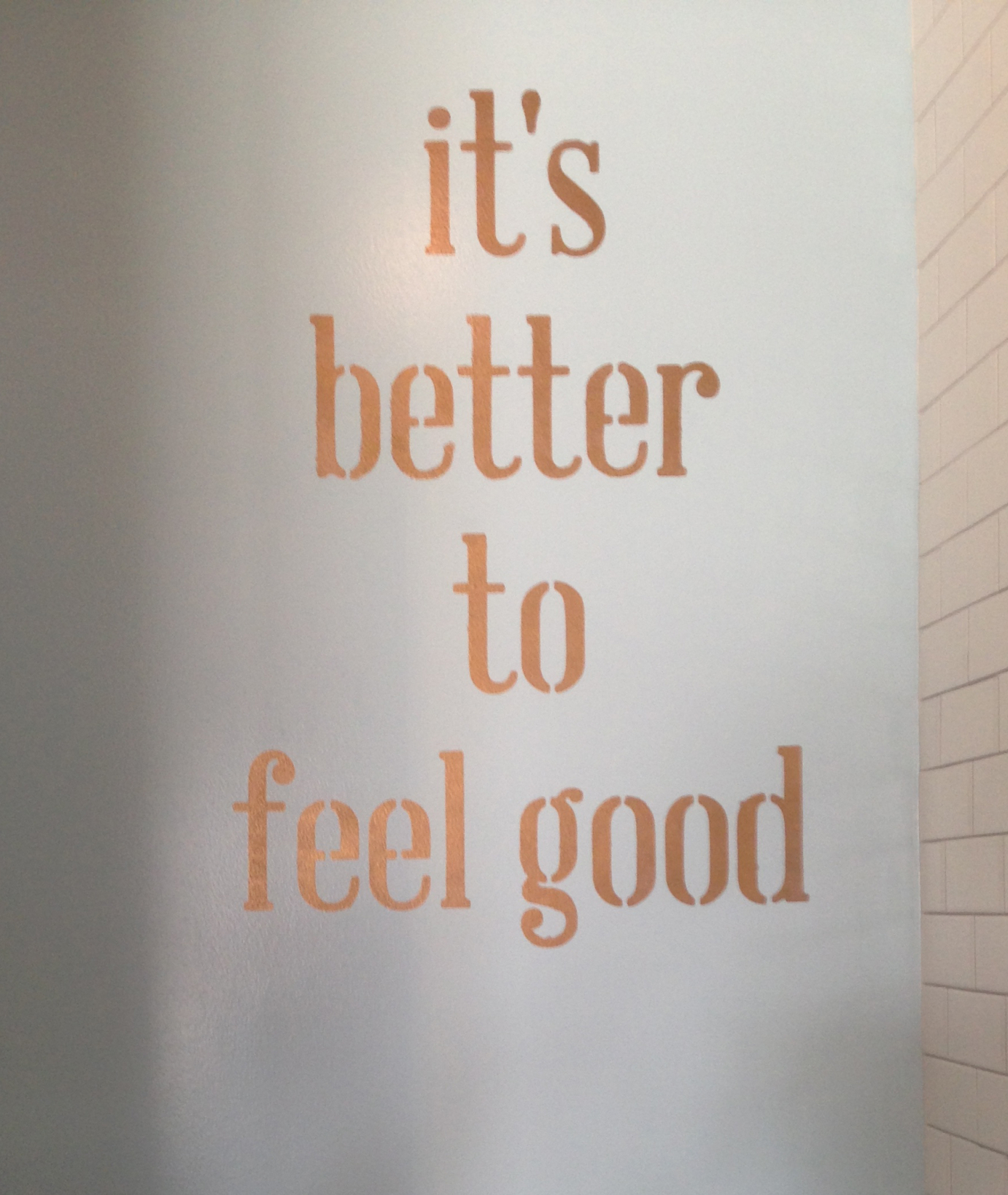
It is Better to Feel Good
Our creation of the tagline has been directly felt in the store design and is a constant in social media and various special events.
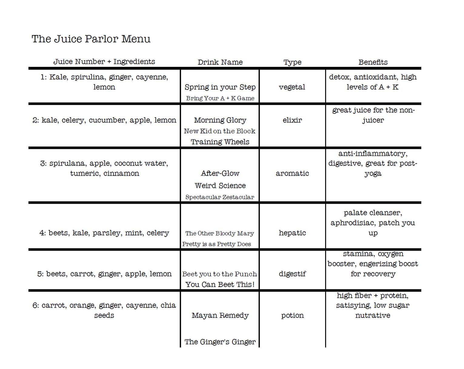
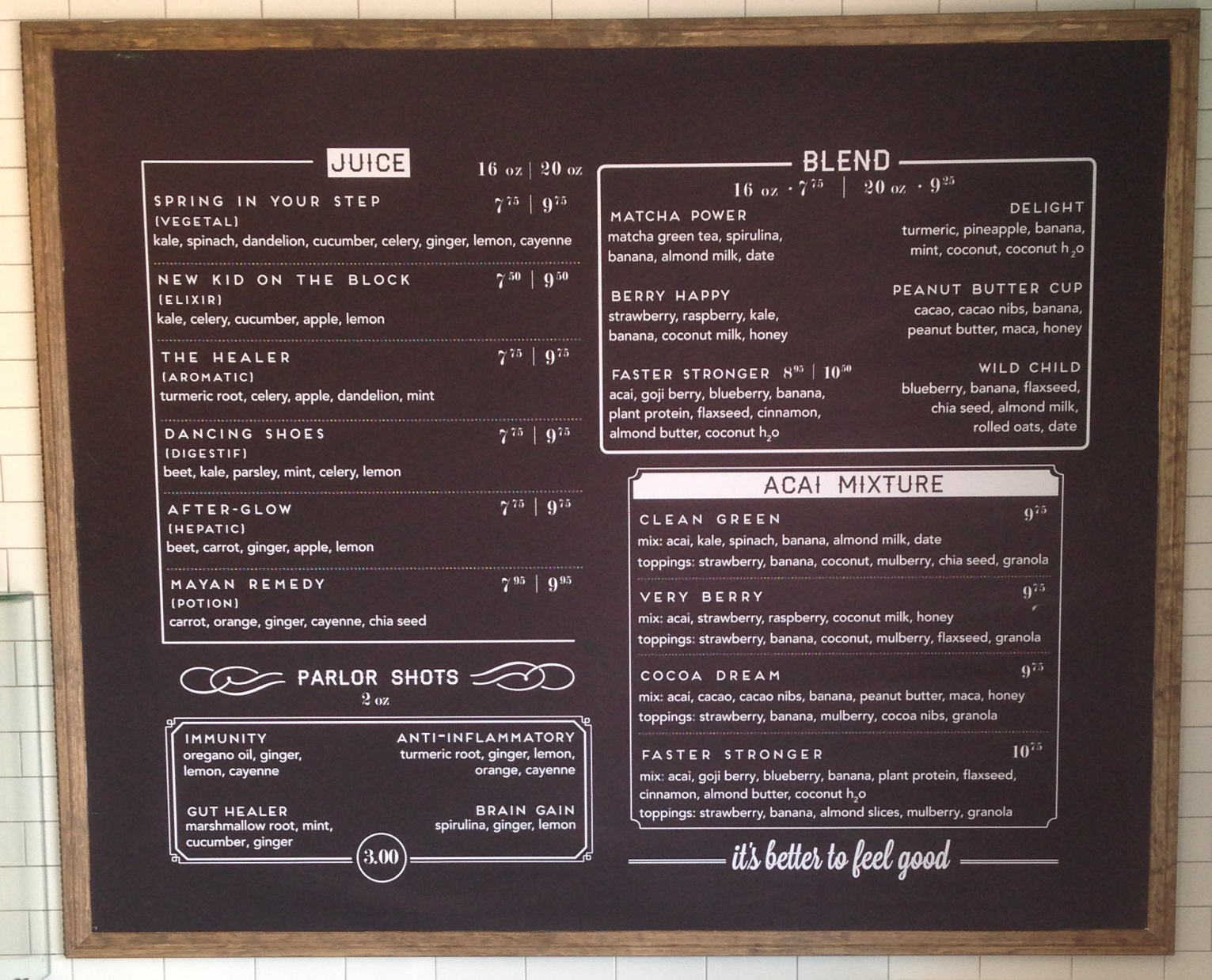
We developed a matrix of juices and set up a naming study of types of juice based on the concept of tonics, vegetals, elixirs, digestifs and potions.
Everything in Its Place.
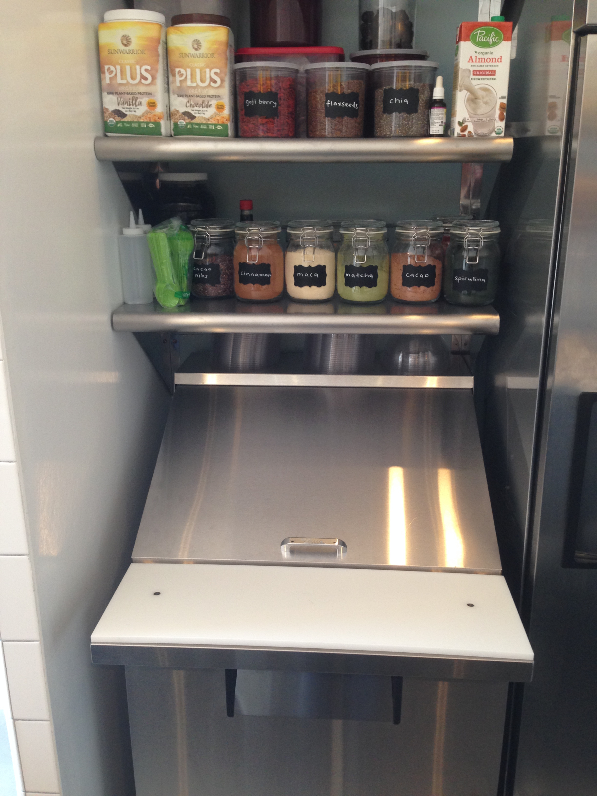
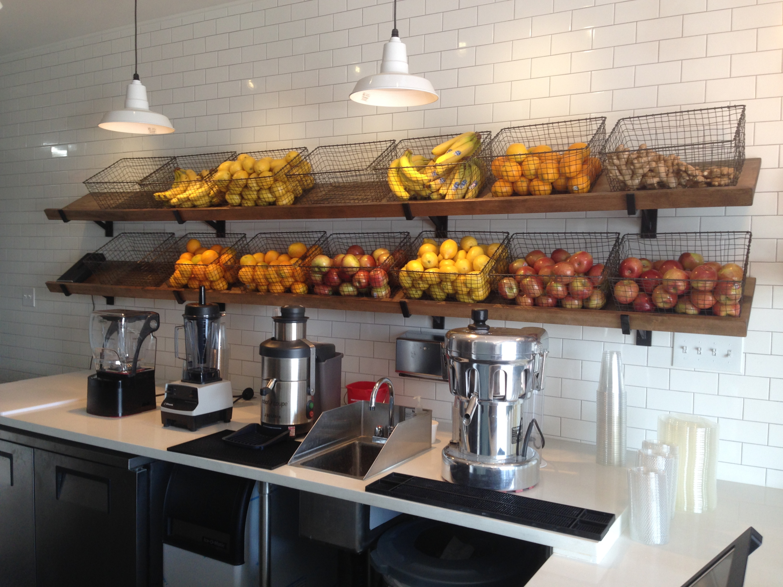
Even small spaces require a minimum of storage that becomes a game of Tetris to balance linear storage while with beauty. Our fresh fruit storage became glorious mesh baskets set on angled shelves. They were hung with custom brackets to capture just the right angle for ergonomic fruit selection and display. Fitting in the required number of sinks, floor drains and cold storage in a 10 x 36 space was a delightful exploration in the life cycle of juice creation. Form definitely followed function.
City Planning, Health Department and Inspections, Oh MY!
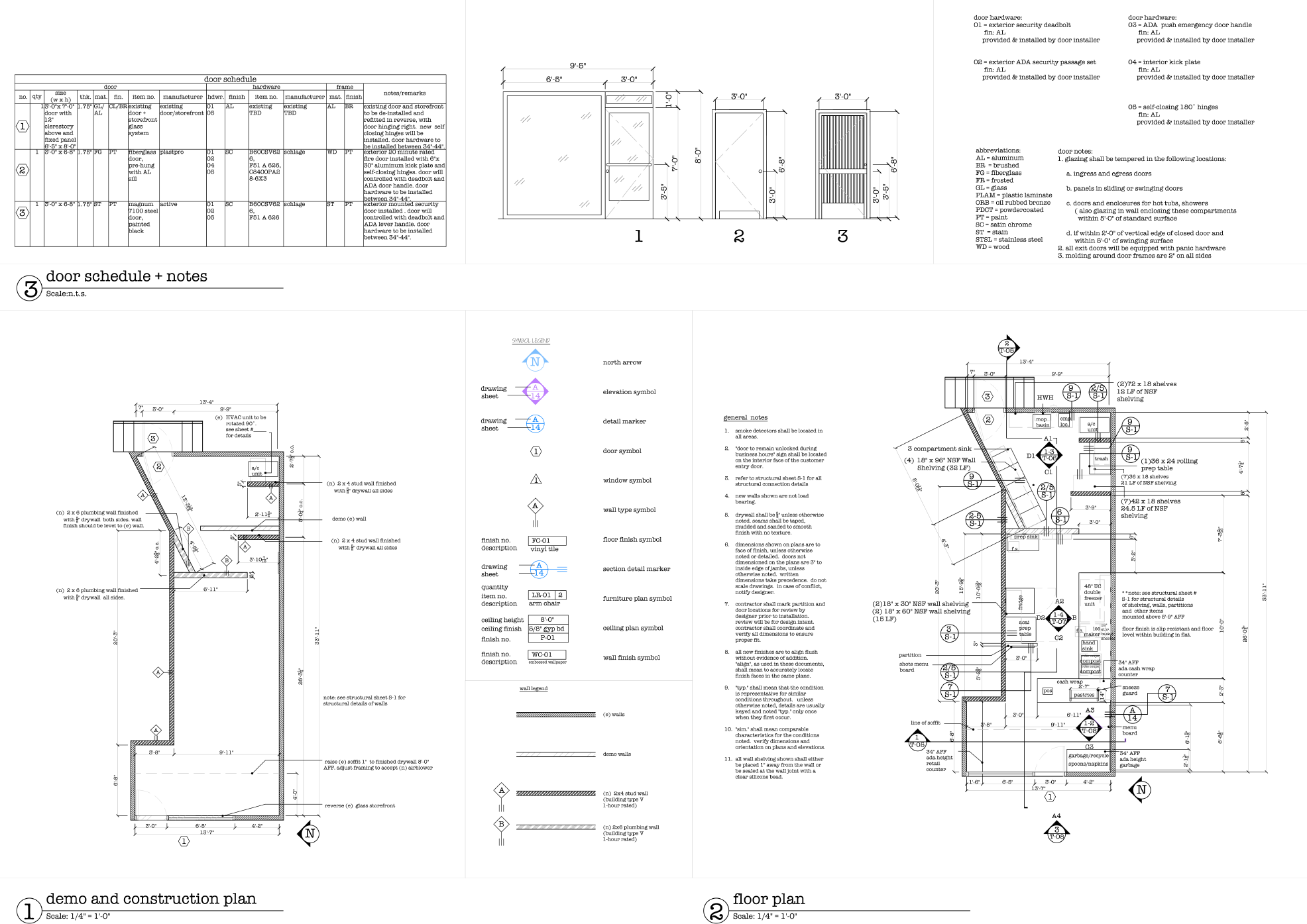
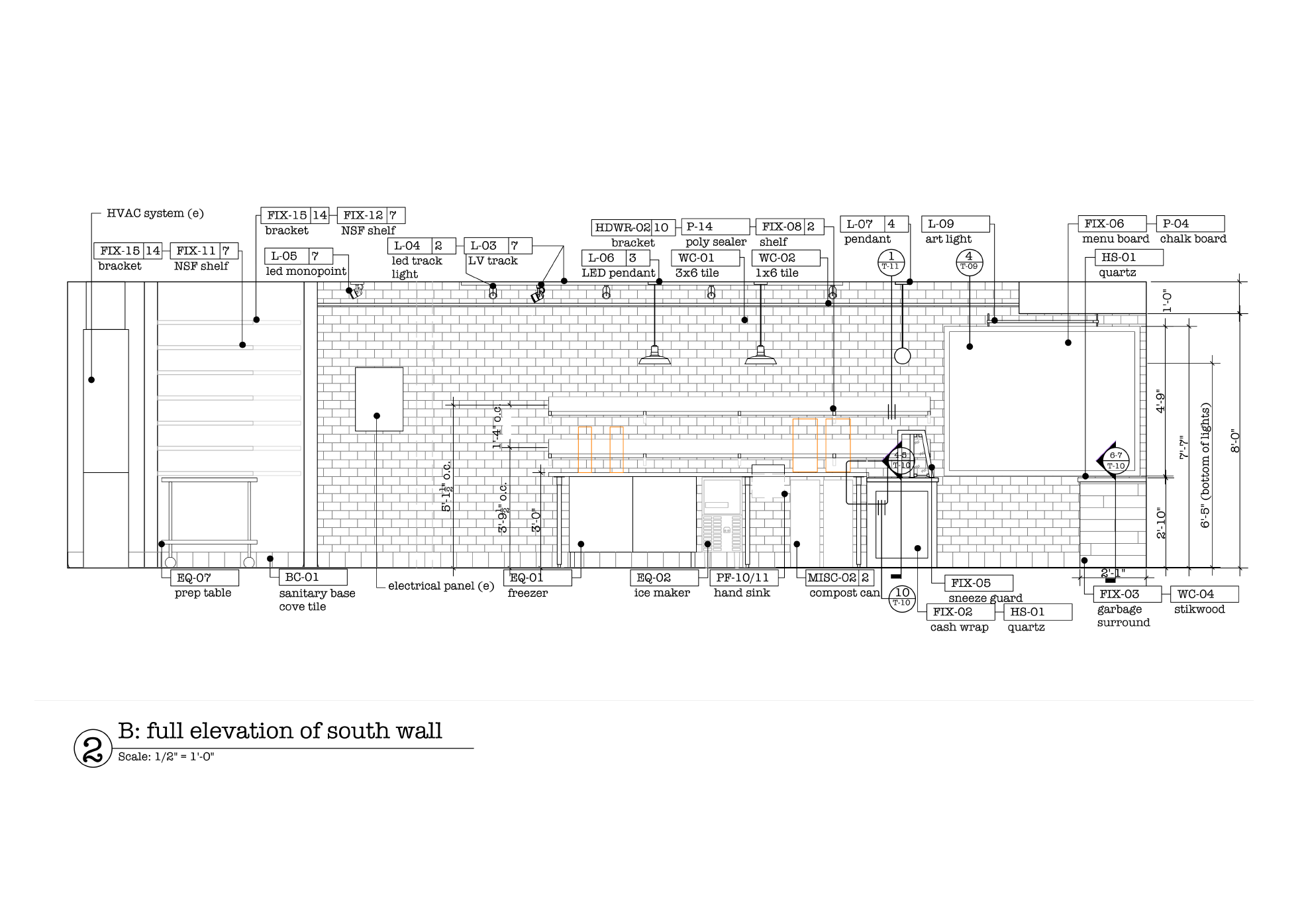
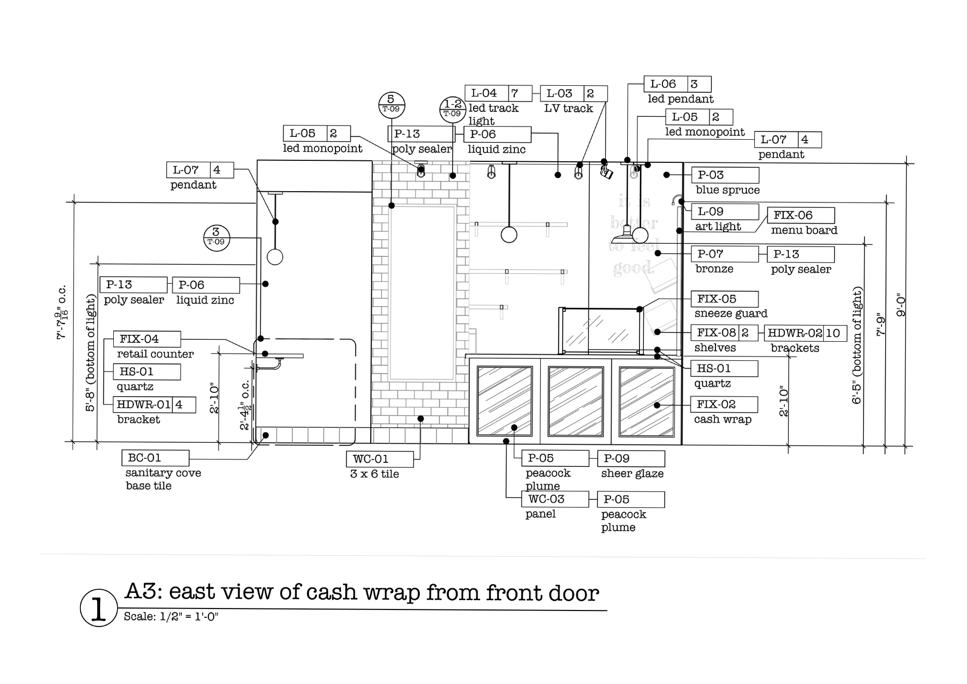
This project, though very small in scale, required every bit of documentation that a restaurant requires. We partnered with the Los Angeles Restaurant Program at LADBS to get our plans expedited reviews and quick turnarounds on revisions and approvals.



6 IMAGES – CLICK IMAGES OR ARROWS TO SEE MORE.
“…A little bit vintage, a little bit delicious”—Noho Arts District.com
We used the small scale to our advantage and kept the walls airy and light. White quartz counters and a mix of gleaming white track and pendant fixtures allowed up to light the space in a strategic and pleasing way. A huge clear glass front did the heavy lift of providing sunlight into the customer side of the counter.
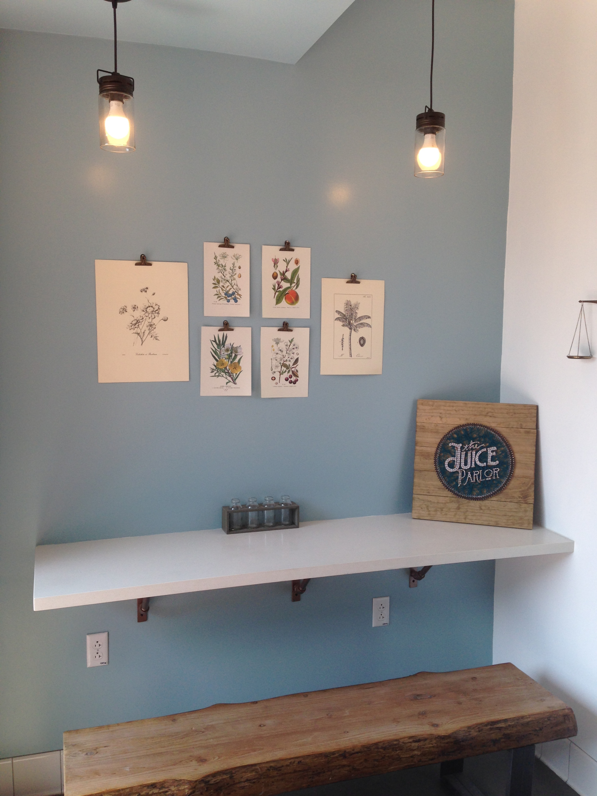
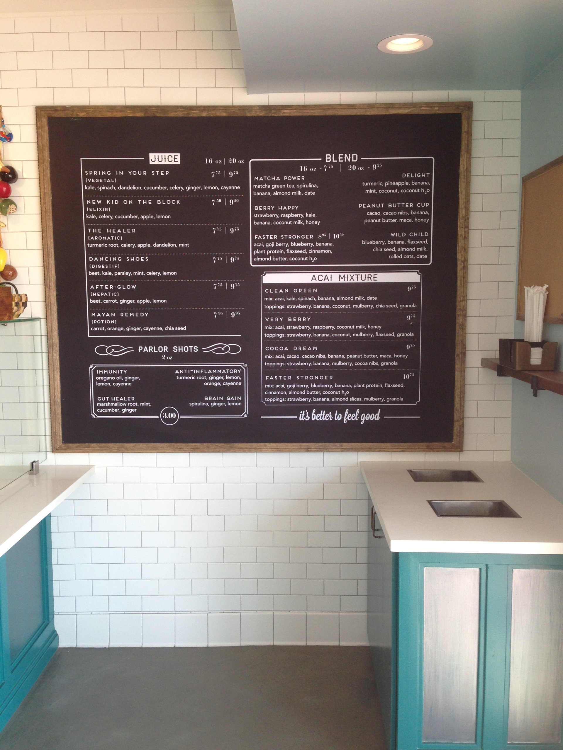
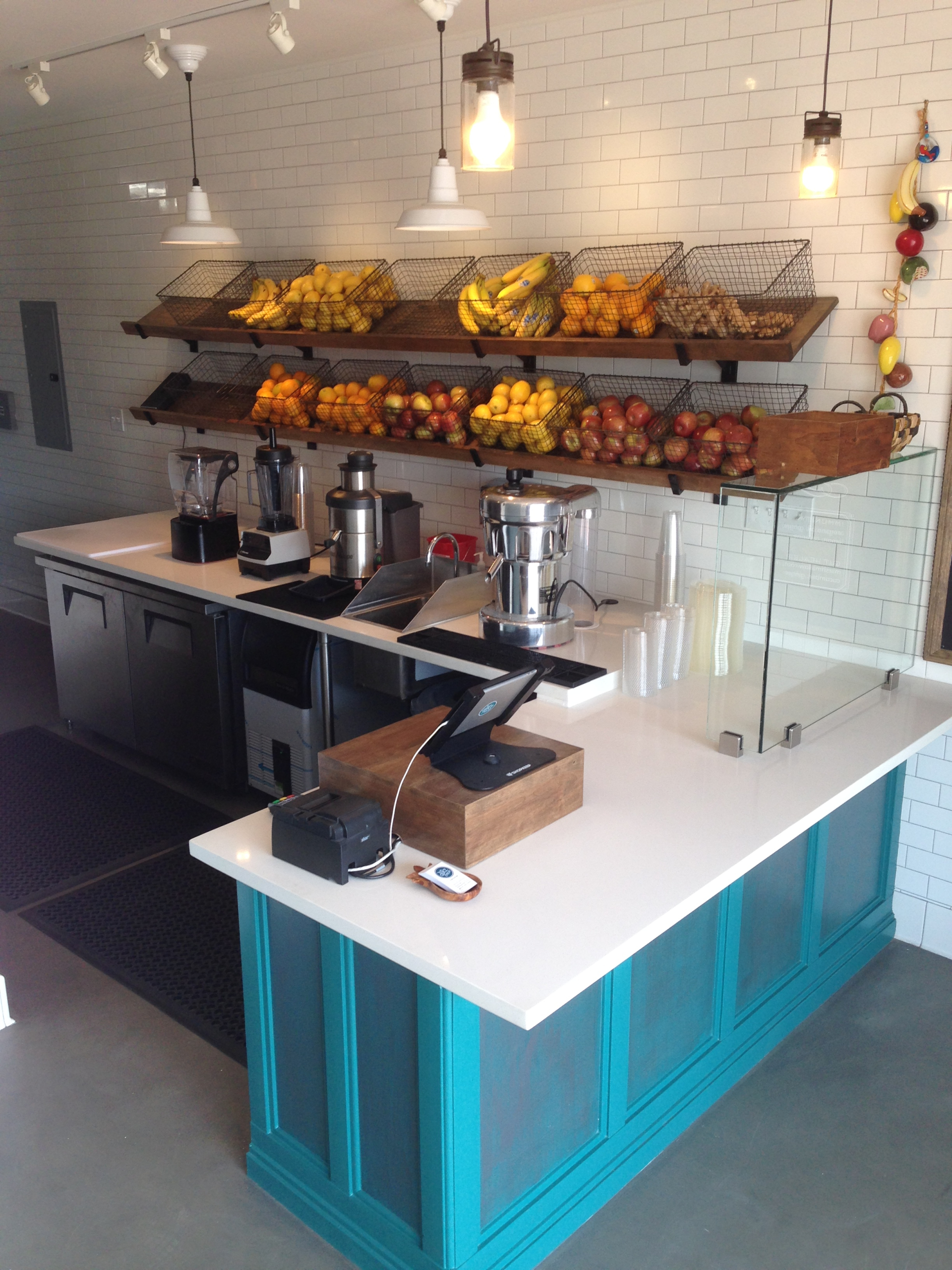
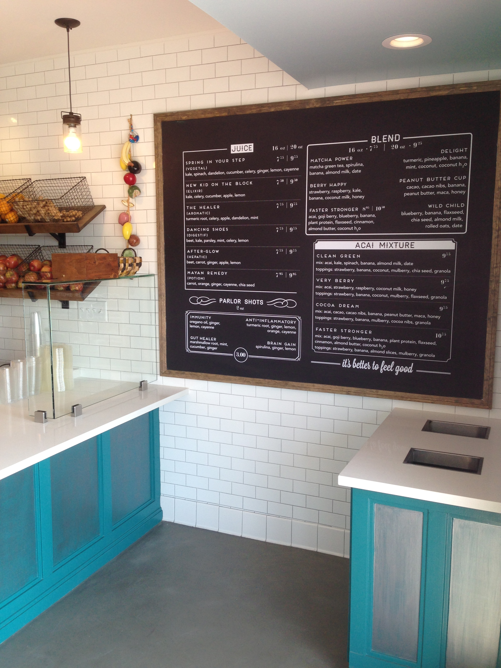
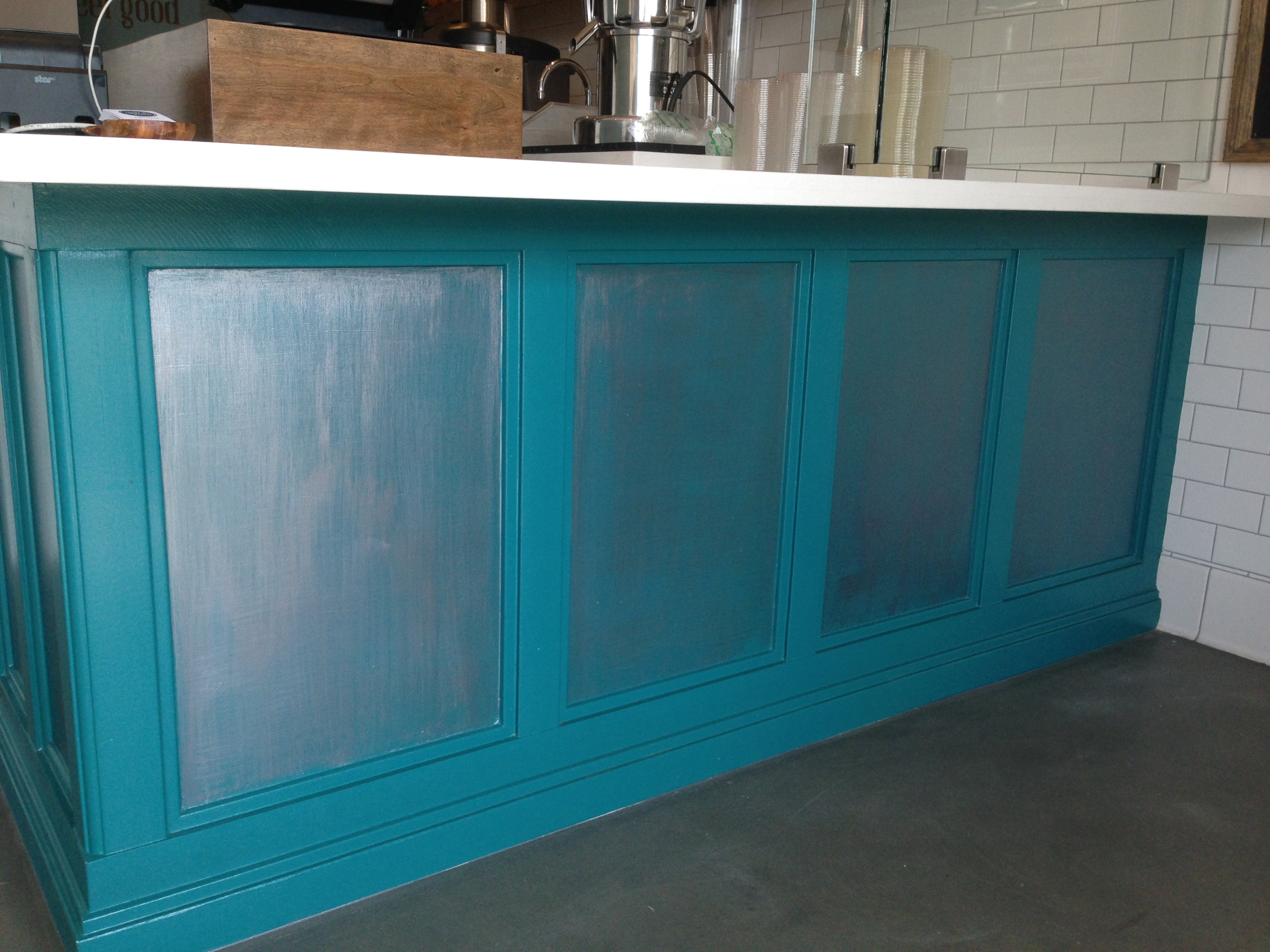
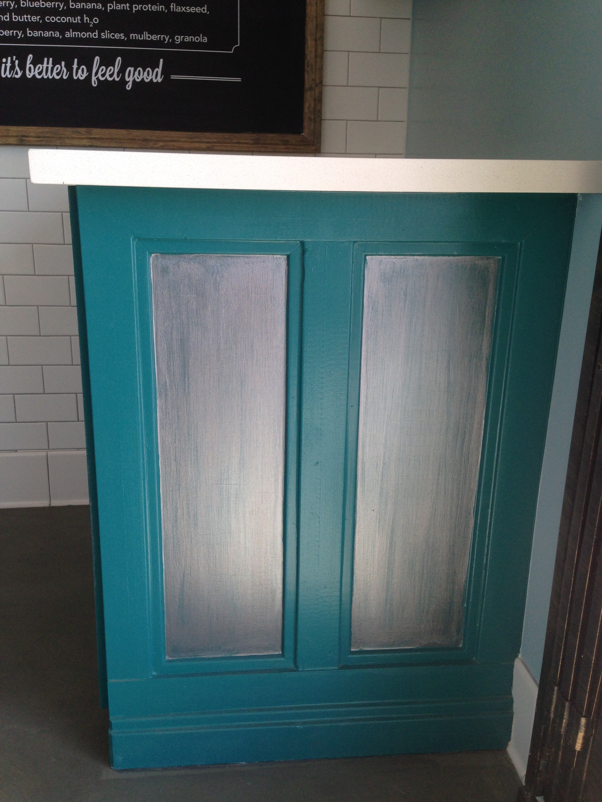
We used a rich teal paint on the cabinetry with a silvery glaze to give it a slight sparkle and gravitas.
Project Details:
|
|
|
|
|---|