LA CANADA FLINTRIDGE, CA
The Proper Restaurant & Bar
RESTAURANTS
About
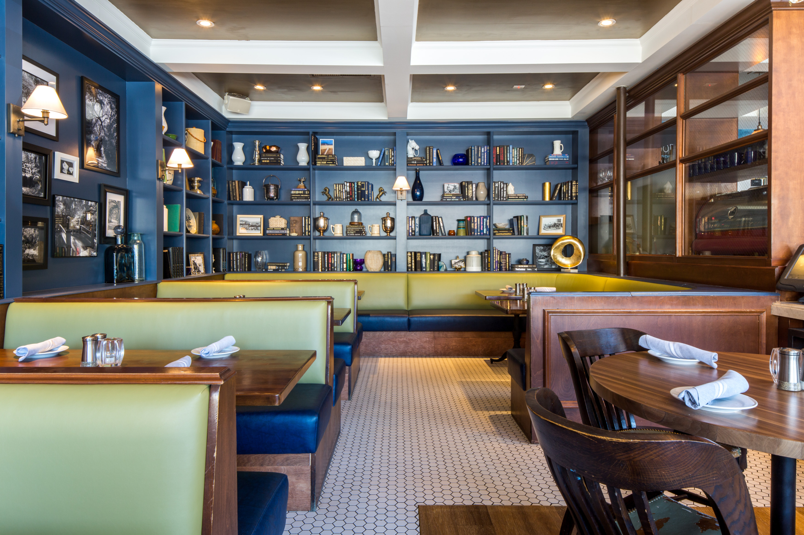
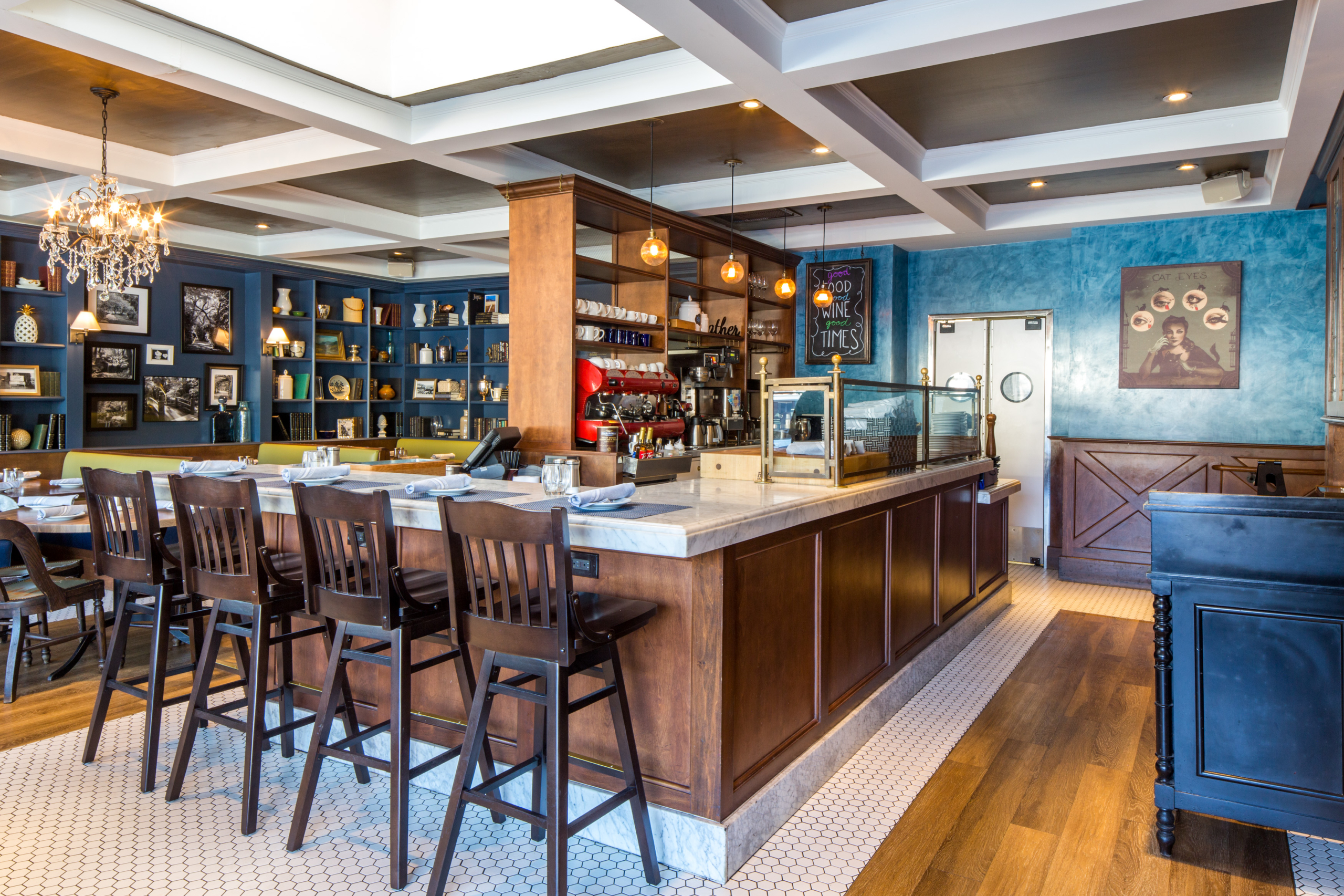
New owners engaged us to resurrect a local destination restaurant and bar. The spaces were divided into two distinctly difference experiences, an upscale glamorous nighttime destination bar and main dining room with service bar, which needed to accommodate brunch on weekends and daytime service to bring in after-school, family and the ladies-who-lunch crowd.
La Canada Flintridge is a sleepy suburb near Jet Propulsion Labs (JPL) and our directive was to provide the neighborhood with a “Proper Restaurant and Bar”, with a cozy but glam interior that felt sexy at night and fresh during the day. Using a punchy, luxe palate and new furnishings, we repurposed the architectural features that were already working. We added a mix of shimmery wallpapers and silky Venetian plaster to harness missed opportunities in the tactile feel of the walls. We also developed a collection of custom art; mischievous moments that exude sophistication and subtle humor-poking fun at the idea of a “Proper night out”.
“…our designer really knocked it out of the park with the decor.” Rick Anderson, Owner
LOCATION
La Canada Flintridge, CA
SIZE
3,000 ft² / 278.7m²
CATEGORY
Restaurants + Retail
CLIENT
Proper Hospitality Partners, LLC
Inspiration
The Proper Way to…
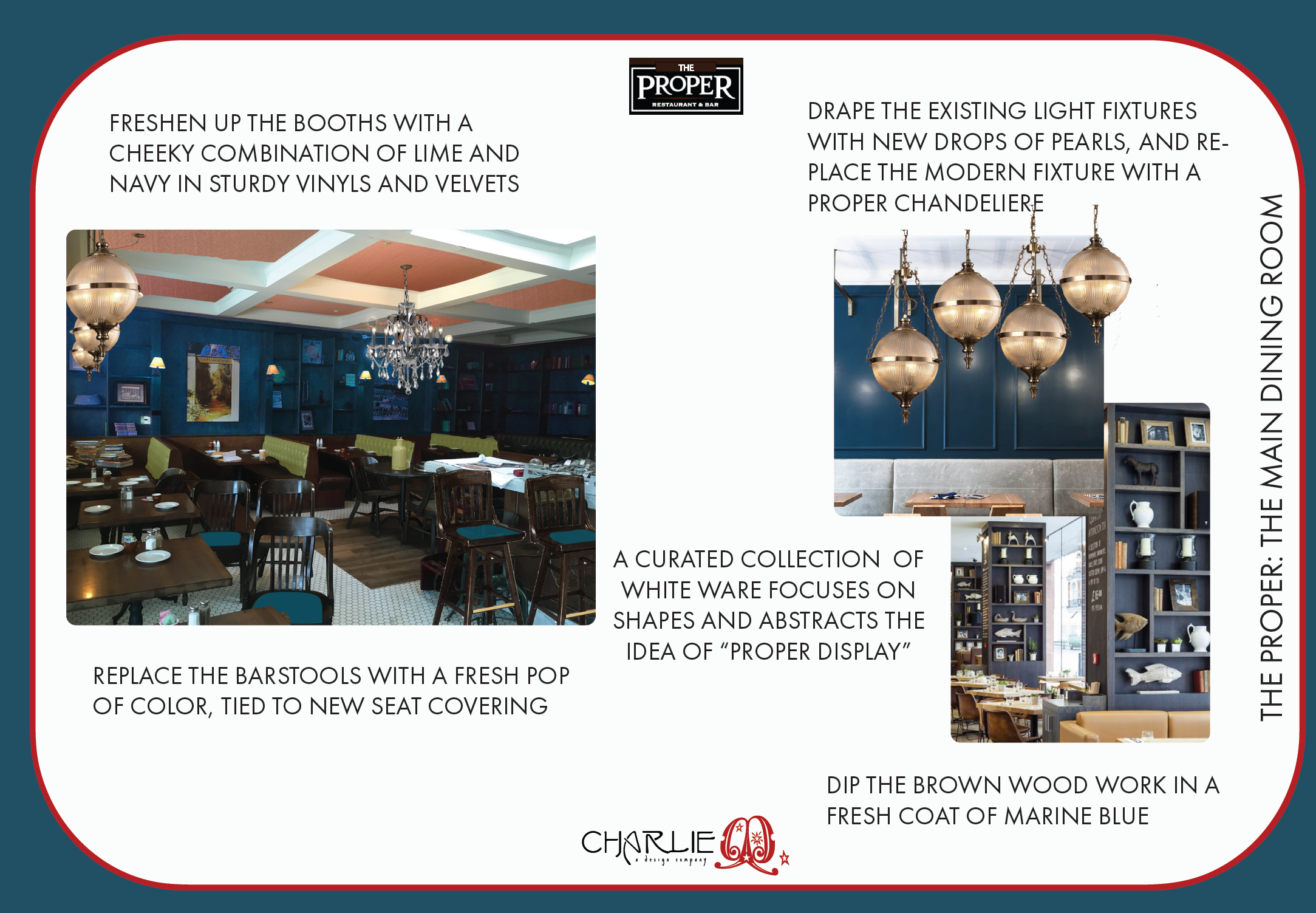
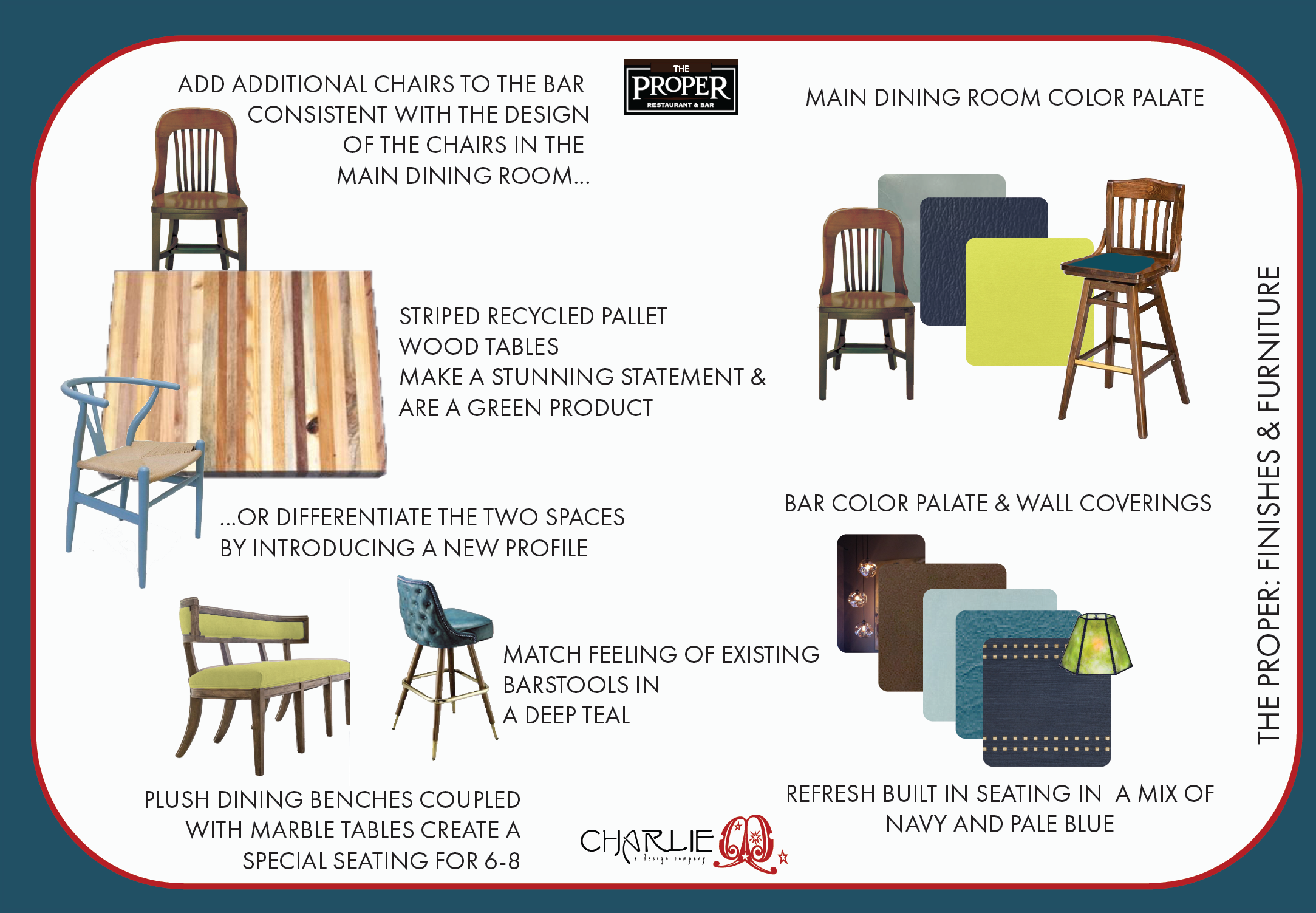
The owners wanted a chic new foodie upscale dining concept with destination bar. We leaned into the idea of the Proper Way to do lots of things, a proper string of pearls, a proper toast, a proper drink. One of the first things we needed to do was address the overwhelming amount of brown wood leftover from the first iteration of this space, especially in the main dining room. The wall of windows facing the parking lot created a sun-drenched airy space during the day. We needed to freshen up the booths with a cheeky combination of lime and navy in sturdy vinyls. Pearlescent globes over existing bulb fixtures elicited that proper string of pearls idea.



6 IMAGES – CLICK IMAGES OR ARROWS TO SEE MORE.
Branding for a Future Franchise
Color schemes that translate across multiple locations and art pieces that speak directly to how we want customers to experience the space.
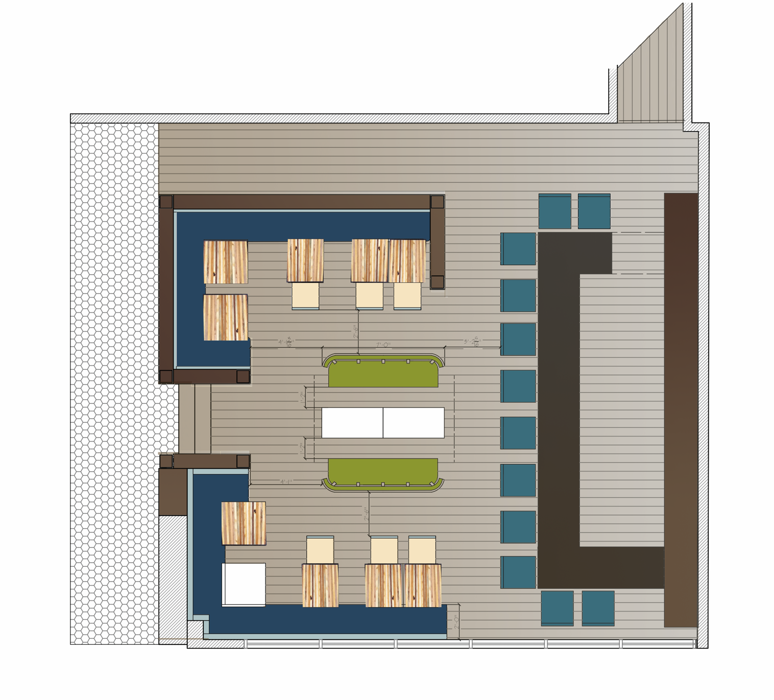
We selected a color scheme and furniture package that could be easily replicated in potential future locations, choosing a palate of aqua and navy for the bar area, with a juicy turquoise and luxe brass for the barstools. Using a softer, apple green velvet on custom klismos benches that wrap around low marble tables, allows us to place a centerpiece seating area in the bar that invites groupings of 8-10 to lounge together and enjoy communal tapas.

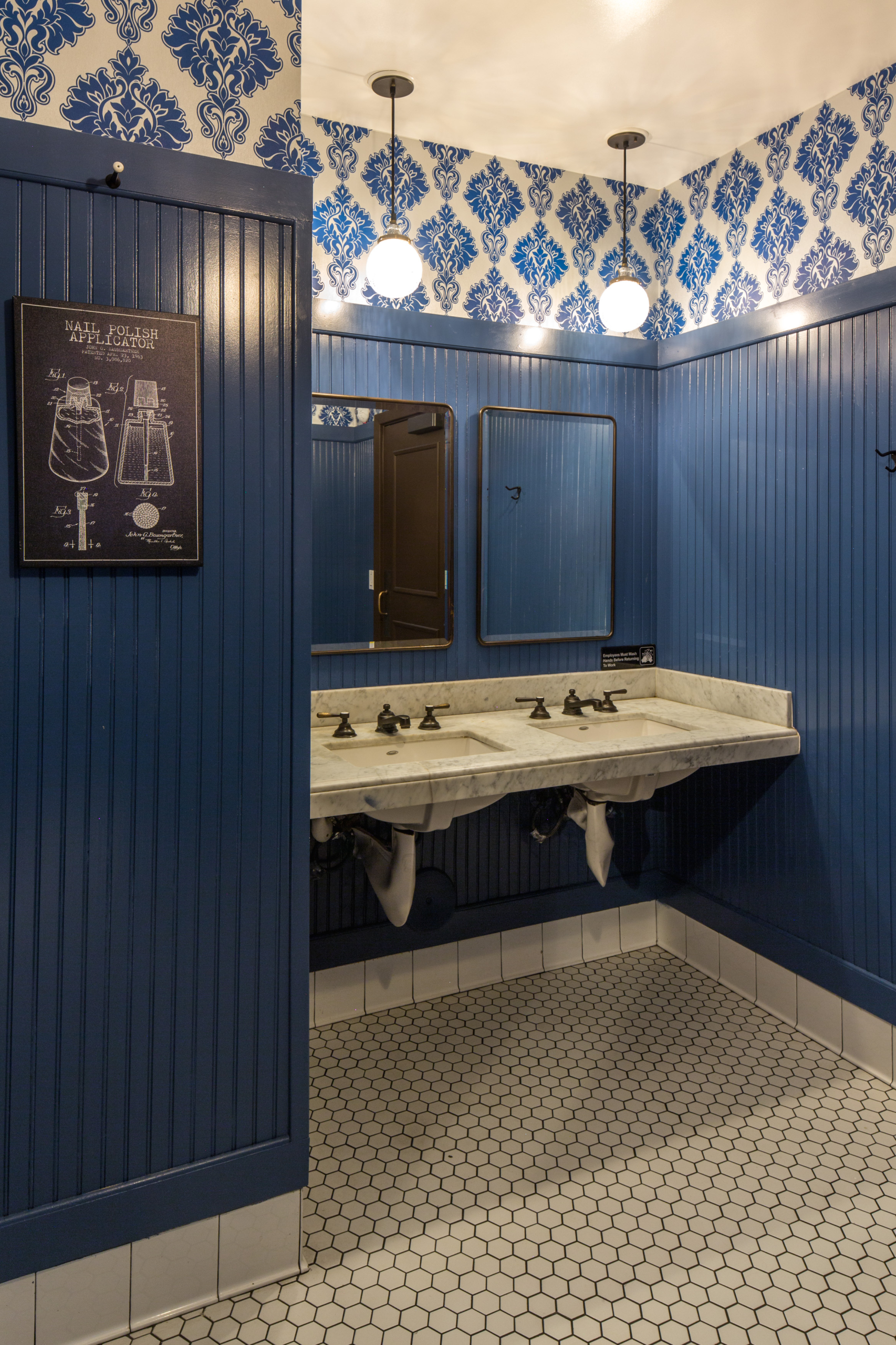
Custom art was keyed to the theme. All in all, we created 8 original pieces and pulled other historical patent material, illustrating the proper way to shave, the original patent for how to properly place a roll of toilet paper.
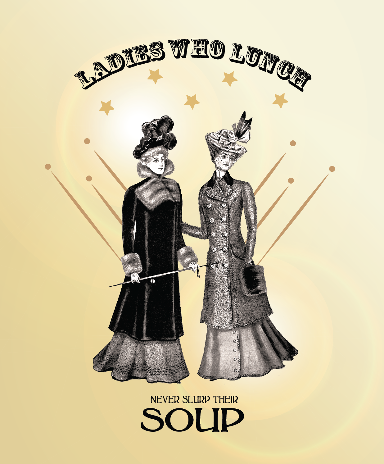
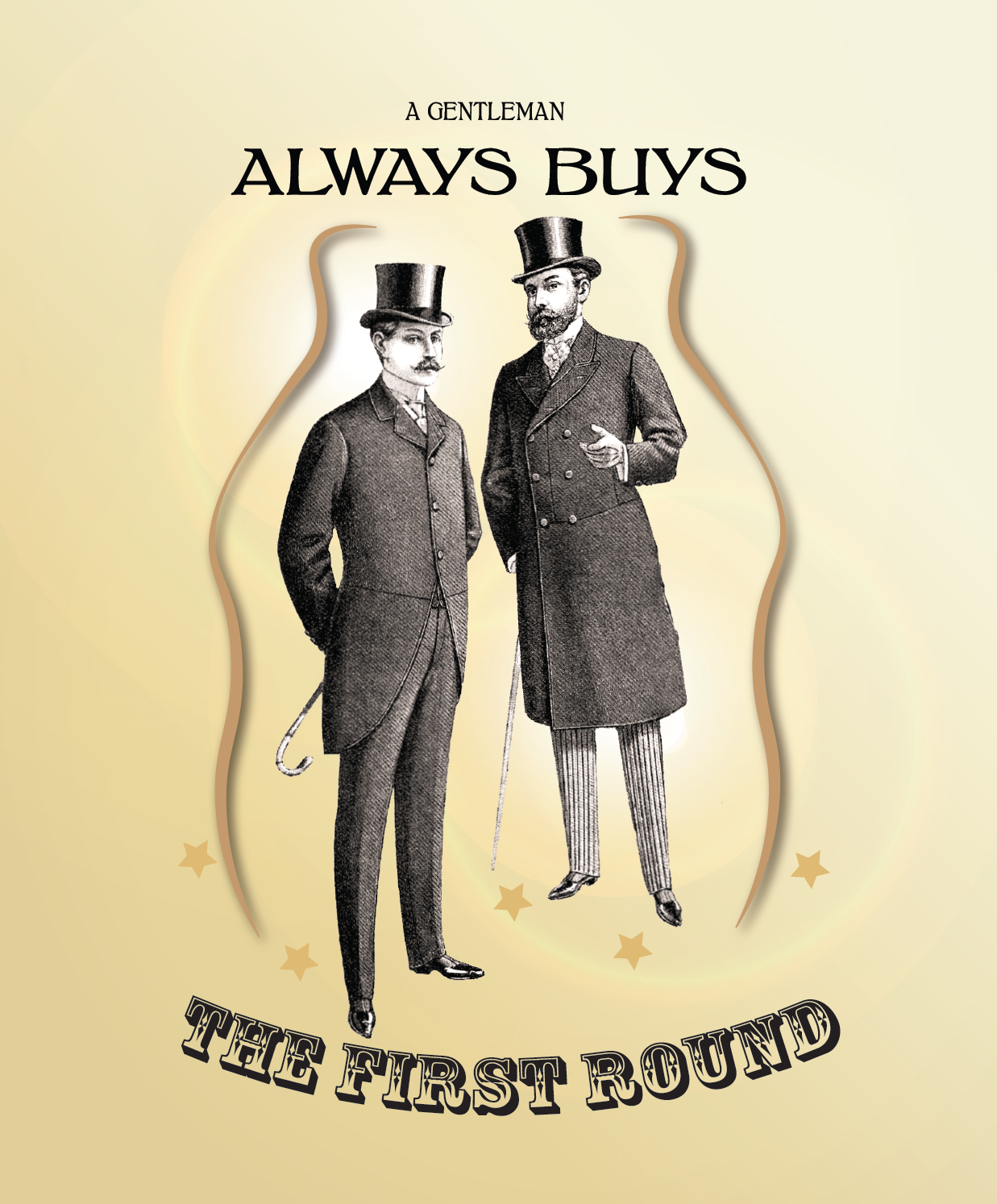
A soft, delicious aqua venetian plaster feature wall highlights a gallery of raw canvas original artwork.

A Proper Foyer welcomes you into the Main Dining Room.
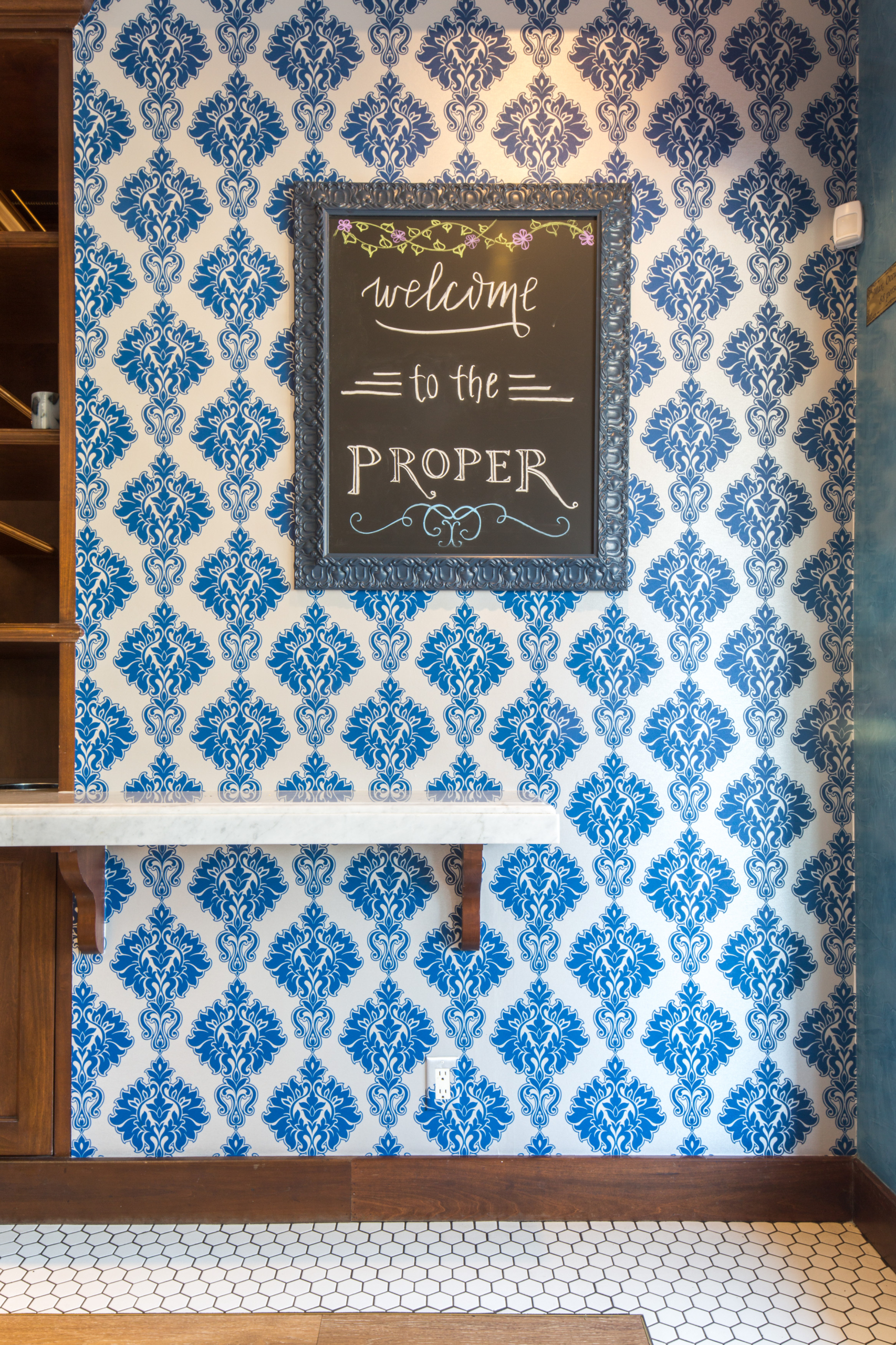
The entry space had no division and needed to be left open for egress -so we devised a waiting area defined by a signature wallpaper, in silvery metallic and navy damask. It allows guests to know they have arrived in the foyer of the manse. The vista into open dining room and service counter introduces the bustle and thrum of casual dining in a curated space. Elevated, yet perfectly relaxed. Sturdy enough to withstand daily lunches and after school activities. Solid walnut tabletops returned the warmth of the original wood surround without being overwhelming. A copper paint on the coffered ceiling reflects light and positively glows in the evenings.
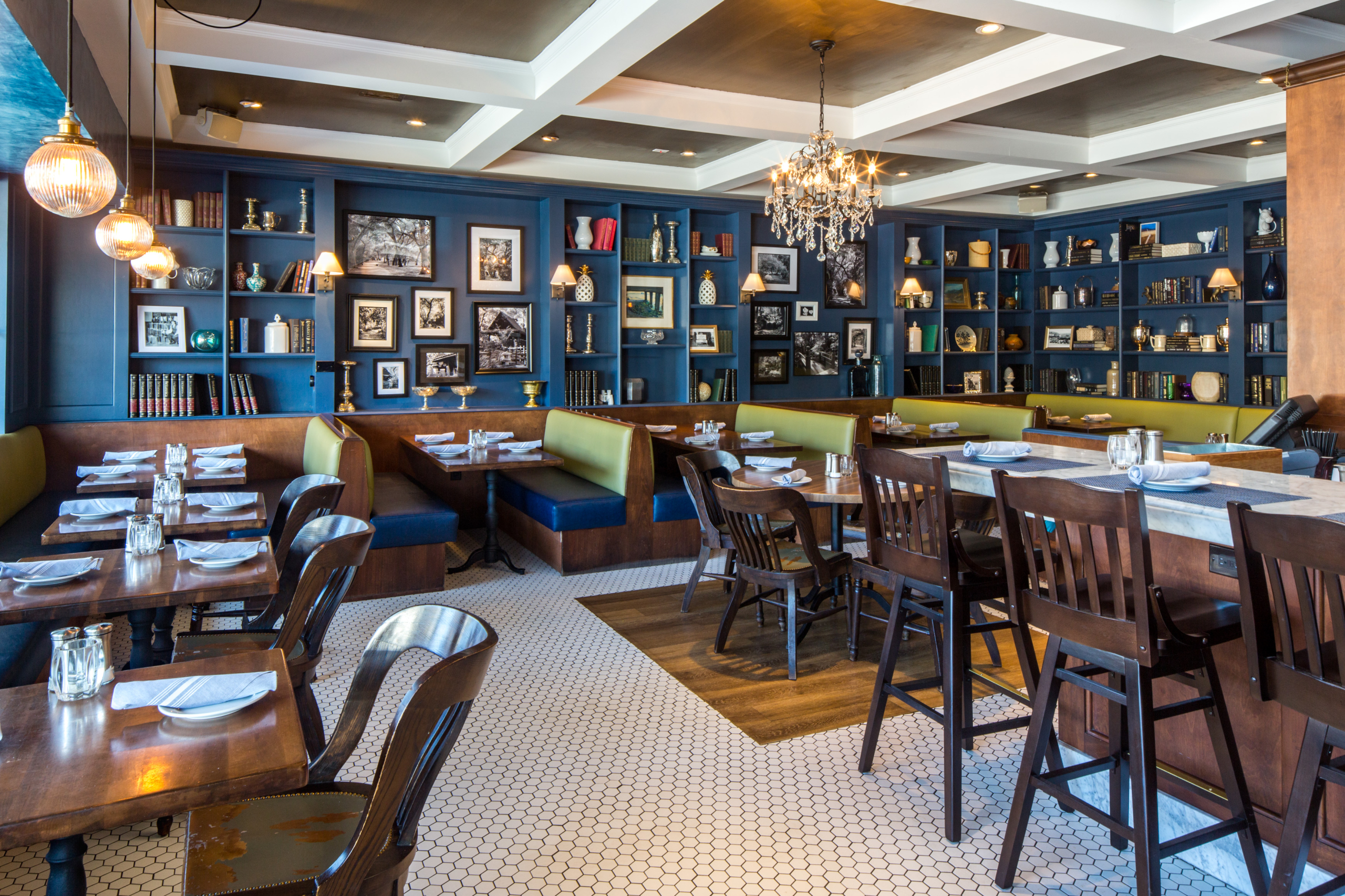


4 IMAGES – CLICK IMAGES OR ARROWS TO SEE MORE.
A Case of the Blues
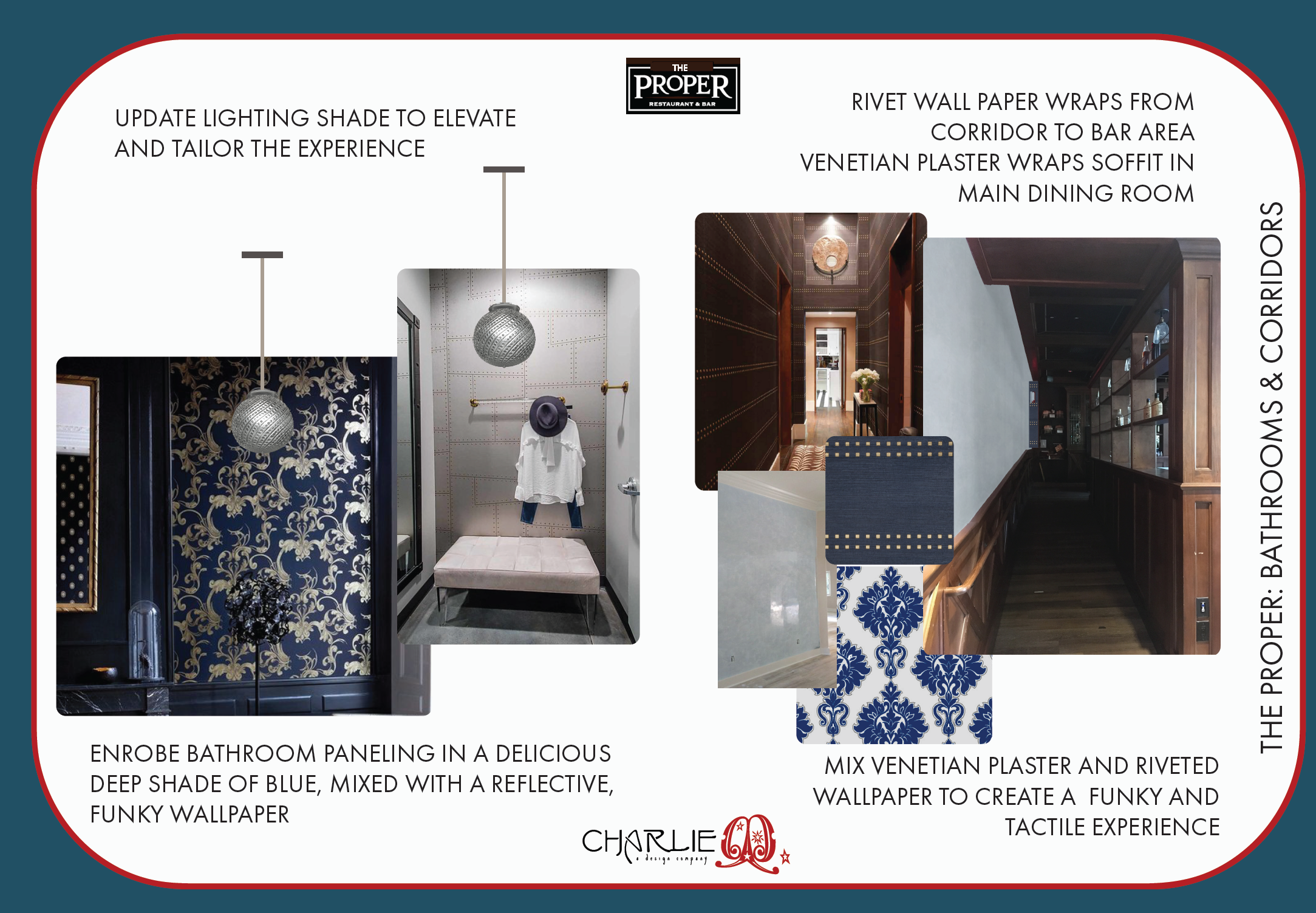
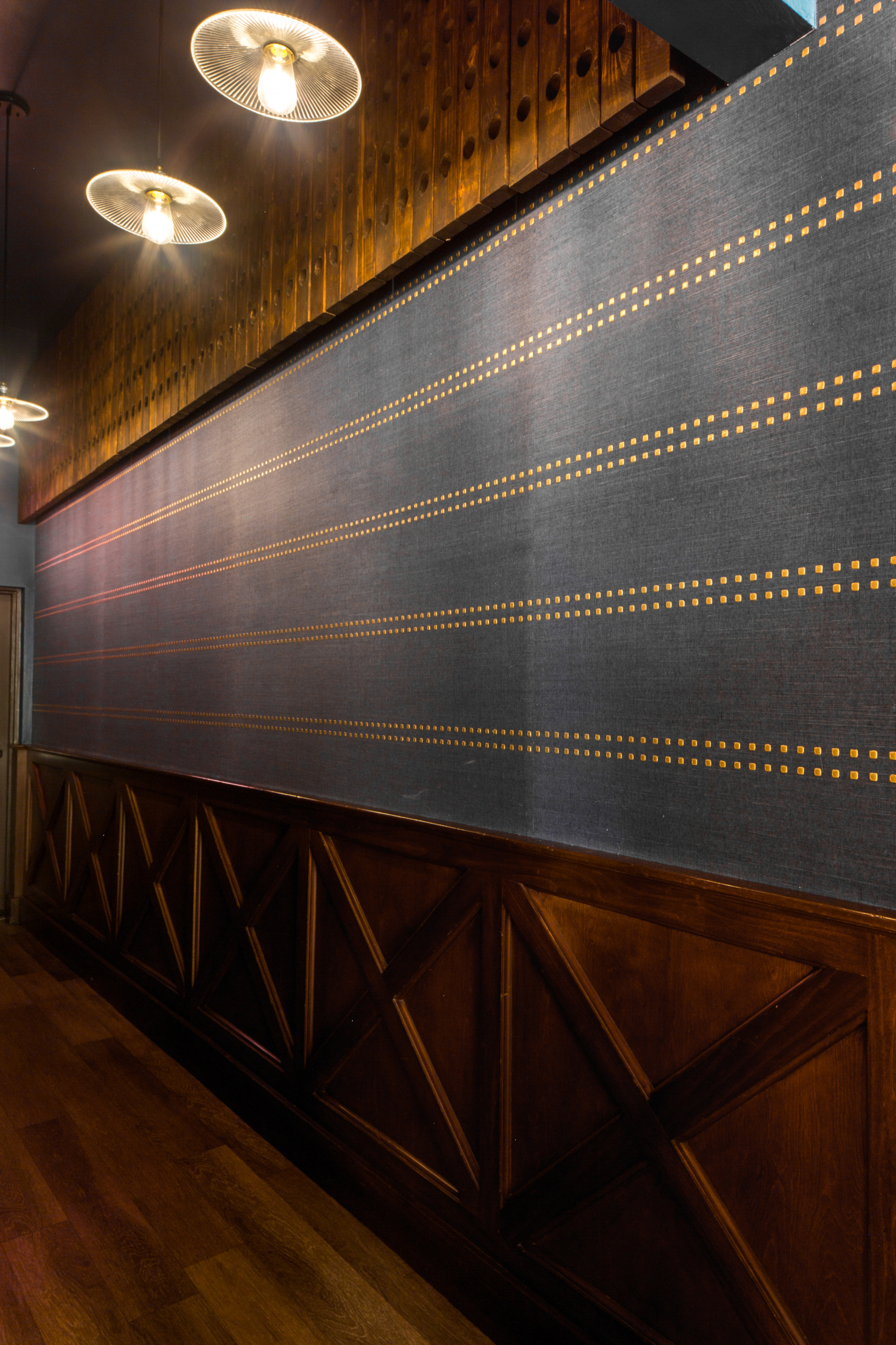
We used variety of blues; royal on the wainscotting in the bathroom, custom navy blue and silver keyed damask wallpaper in the women’s room + a studded silvery wallpaper resembling a fuselage in the men’s room. A mix of vintage art in midnight blue continues the proper journey. In the corridors leading the bathrooms, and in the bar, we used a studded brass and denim jute wallpaper, recalling a favorite pair of Levi’s or a proper set of cufflinks.
Gin up the bar, all that glitters is glass.
The entry to the bar rises three steps up from the dining room. The room is bordered by open shelving on two sides, large plate glass windows on another and the large floor-to-ceiling bar with seating fills the view at the rear of the room. We repurposed stained-glass doors that had been covering cabinets behind the bar and re-installed them as a room divider to bring more privacy to the bar where it meets the dining room. We used the open shelving on the other side to display a collection of vintage cut crystal decanters and provide more cover for the patrons in the bar. We built a second booth and recovered the existing booth to double the seating in the bar.


Details like handmade mica lampshades on the built-in lamps on the bartop, capture a touch of green in the bar area to marry the two spaces.


Project Details:
|
|
|
|
|---|